The "Serene Dining" brand identity is crafted to evoke a sense of calm and sophistication through a cohesive color palette.
The "Serene Dining" brand identity is crafted to evoke a sense of calm and sophistication through a cohesive color palette. Drawing inspiration from subtle earthy tones, this palette captures the essence of understated elegance, ideal for culinary brands aiming to convey a serene and inviting atmosphere.
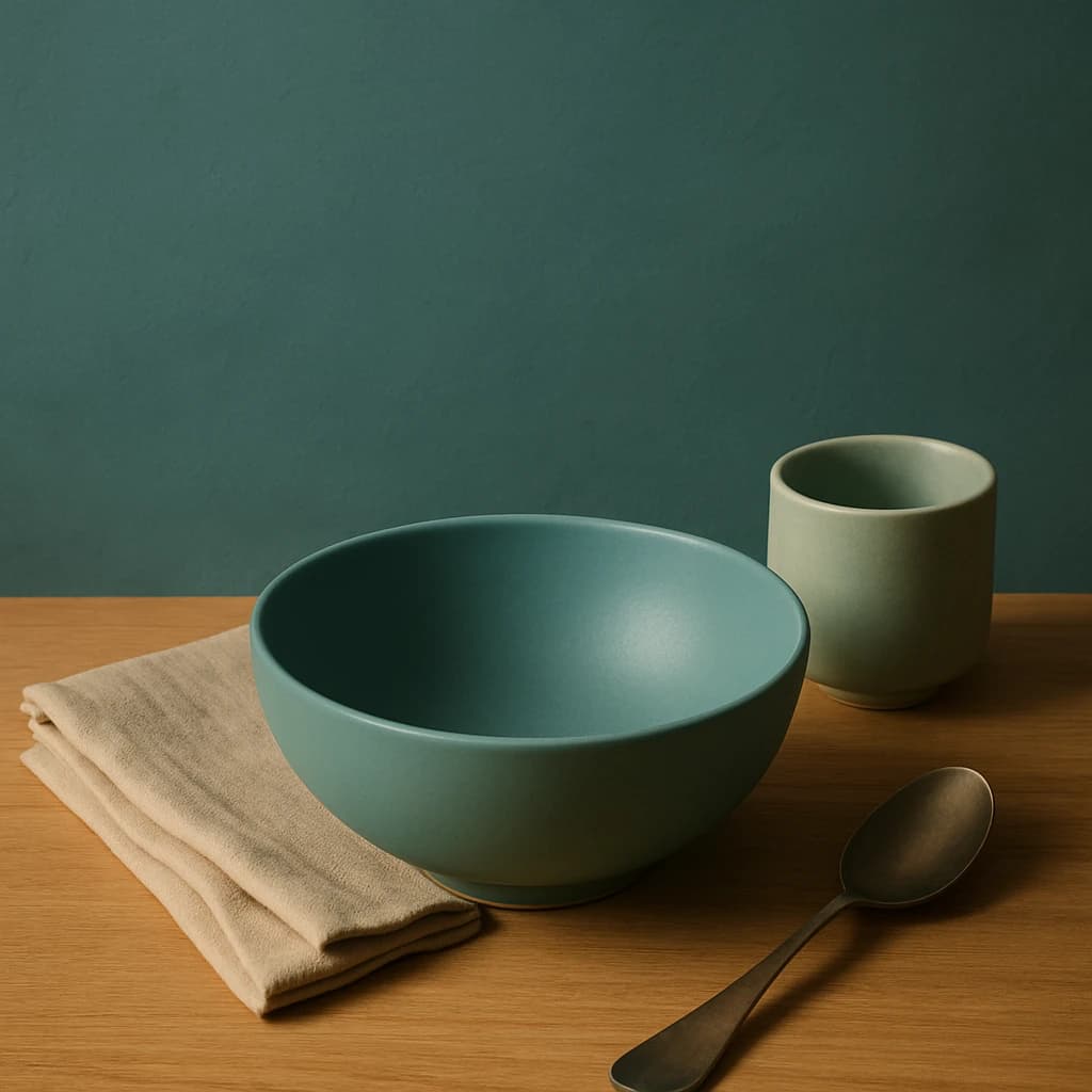
The primary color, Deep Teal (#4a6e66), serves as the foundation, perfect for call-to-action buttons and active links, providing a strong yet soothing visual anchor. The secondary hue, Sage Mist (#a8b8a5), complements this by adding subtle emphasis to secondary buttons and hover states, ensuring a seamless user interaction.
For accentuation, Sandstone Beige (#d9cbb8) is employed, adding warmth and highlights to accent elements. This creates a harmonious balance when paired with the core hues. The choice of Ivory Linen (#f5f0e7) as the surface color ensures a clean and inviting backdrop for cards and page backgrounds, enhancing readability and focus.
Finally, Warm Taupe (#7b6f61) is selected for text, offering clear legibility on light surfaces while maintaining the overall warm tone of the palette.
This palette is restrained yet sufficiently broad to allow flexibility across various design elements, maintaining a consistent brand message of calm culinary elegance.


