
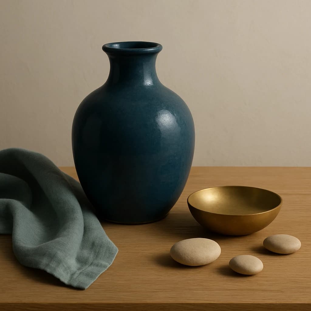
A curated brand color palette inspired by a serene tabletop scene.
Introducing the July 2026 color palette for an identity rooted in elegant simplicity. This curated selection draws inspiration from a serene tabletop scene, harmoniously blending organic hues with refined textures.
The primary color, Cerulean Depth (#2c5c6d), serves as the foundational hue, ideal for Primary CTA and active links, offering a calm yet assertive visual anchor. Paired with Sand Dune (#d7c3a7) as the surface color, it provides a balanced backdrop for card surfaces and page backgrounds.
For secondary interactions, Eucalyptus Mist (#748c8d) is employed for hover states and secondary buttons, adding a gentle, nature-inspired touch. The palette is elevated with Golden Brass (#b89459), an accent color that enhances accent elements and highlights with its warm, metallic sheen.
To maintain clarity and elegance, Ivory Linen (#f0e9dc) is designated as the neutral color for backgrounds and borders, supporting the overall aesthetic with subtle sophistication. Finally, Slate Ink (#3b3a36) ensures readability as the text color for body text on light surfaces.
This palette emphasizes a restrained yet impactful use of color, encouraging expansion into additional hues when needed to maintain brand consistency across diverse applications.


