
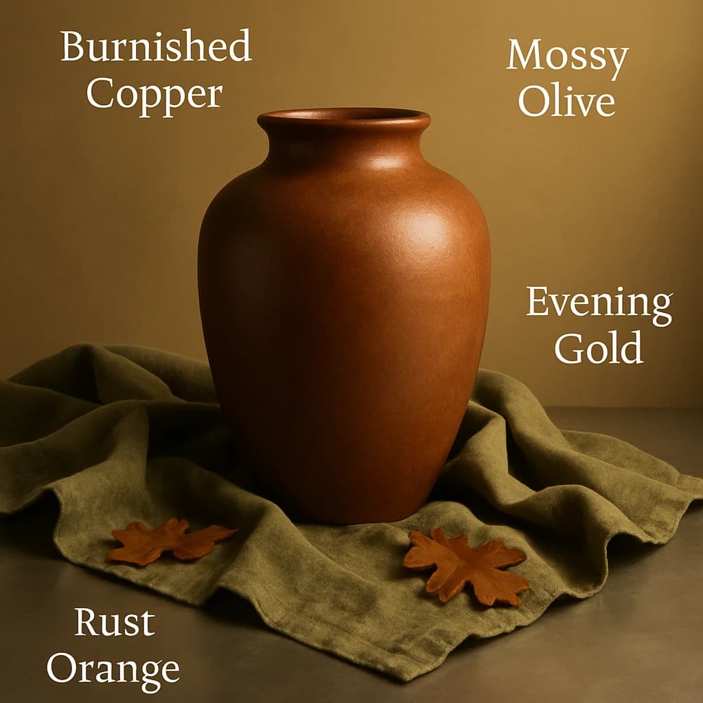
Explore this week's curated brand palette, inspired by autumnal warmth and earthy tones.
Introducing this week's Pixeliro curated palette, channeling earthy sophistication. Our selection draws from natural shades that evoke warmth and grounded elegance, ideal for brands looking to convey a sense of timeless style.
The primary color, Burnished Copper (#b87333), serves as a dynamic focal point for primary CTAs and active links, offering an engaging and warm touch. Paired with the secondary color, Mossy Olive (#7c6a54), these hues create a harmonious balance, ideal for secondary buttons and hover states, enhancing user interaction with subtlety.
To add a touch of opulence, Evening Gold (#d4a373) is incorporated as an accent color for icons and small graphics, infusing the design with a sophisticated shimmer. The neutral tone, Cinnamon Dust (#f1e4d3), provides a soft background for card surfaces and page backgrounds, ensuring that content stands out without overwhelming the viewer.
Finally, Rust Orange (#4a3f35) is designated for text, ensuring readability while maintaining the palette's cohesive warmth.
This palette is perfect for brands aiming for an elegant, earthy aesthetic. For extended use, consider introducing deeper or lighter variations of these hues to enhance depth and versatility without losing the core identity.


