
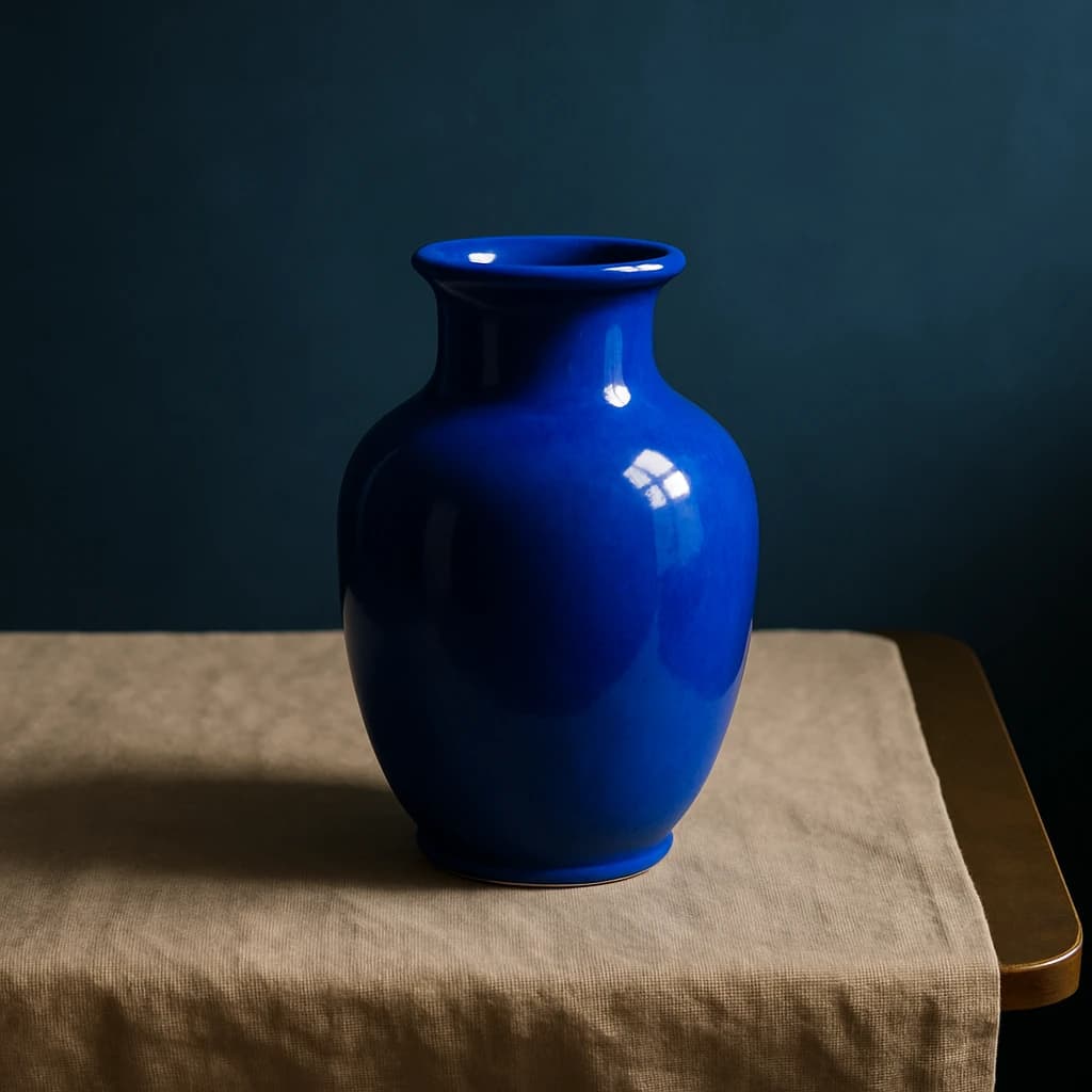
Explore the refined color palette inspired by a vibrant blue ceramic vase, designed for a sophisticated art and design brand.
The "Cerulean Vase" brand color palette encapsulates artful sophistication, drawing inspiration from the vivid blue ceramic vase against a soft, muted background. This palette is tailored for a brand identity that values luxury and artistic expression, perfect for high-end art and design enterprises.
Color Roles & Usage:
- Cerulean Depth (#1a4b73): This bold primary hue serves as the focal point for primary CTAs and active links, ensuring a striking and memorable interaction.
- Slate Horizon (#2b3e50): A versatile secondary color, ideal for secondary buttons and hover states, adding depth without overwhelming the primary elements.
- Linen Sand (#f0e6d4): This gentle surface tone provides a subtle yet sophisticated backdrop for cards and page backgrounds, enhancing readability and elegance.
- Soft Pewter (#b3b3b3): As a neutral, it offers a refined touch to dividers and subtle backgrounds, maintaining a cohesive aesthetic across platforms.
- Pure White (#ffffff): Essential for body text on darker surfaces, ensuring clarity and a clean, professional look.
Deciding when to extend or restrain the palette will depend on the context and brand application. For broader applications, consider additional accent tones derived from the image, maintaining harmony with the existing colors. Restraint, however, maintains a focused and sophisticated brand identity, emphasizing the core values of luxury and artistic expression.


