
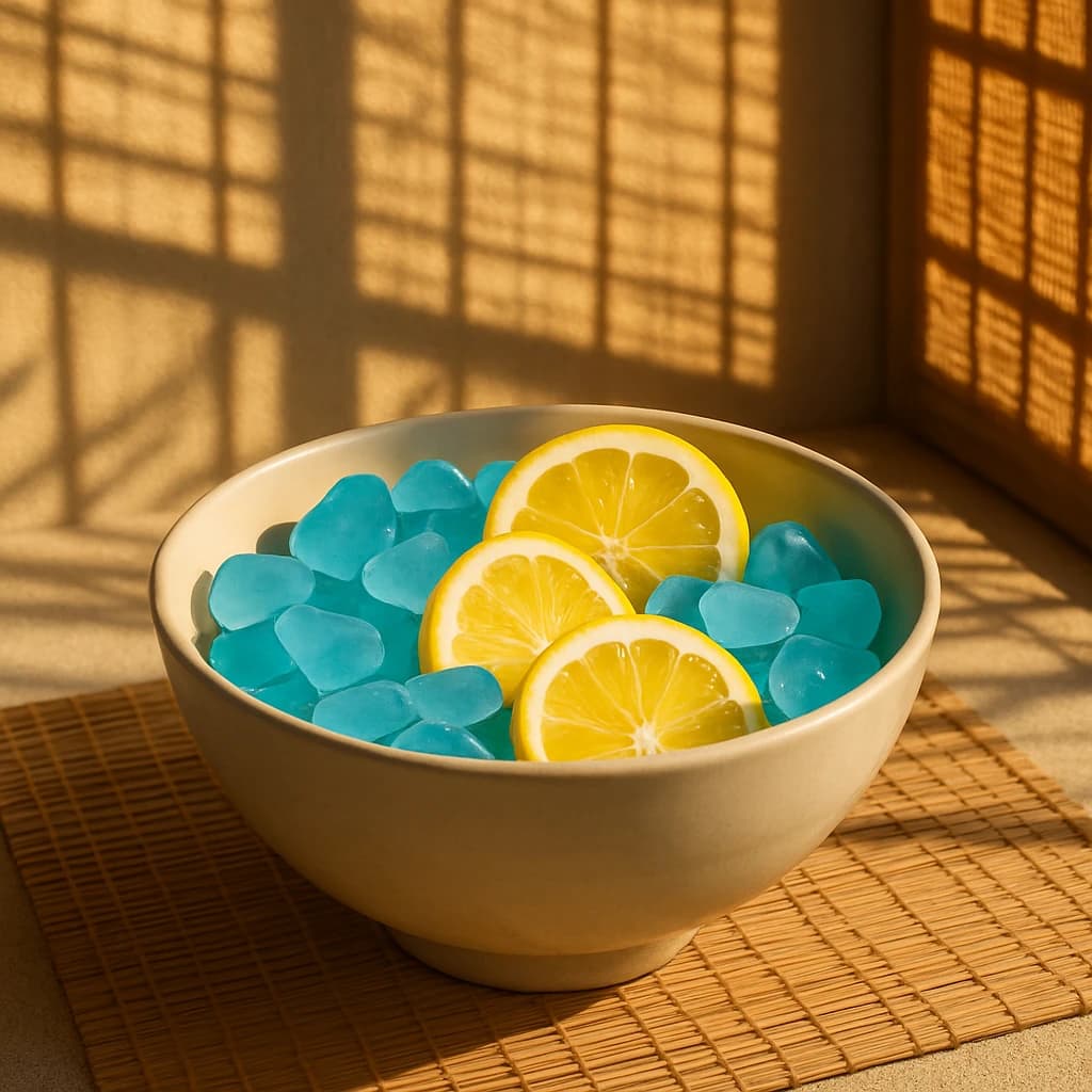
A tranquil blend of sunlit warmth and cool serenity, embodying Japanese aesthetics.
In this serene palette, inspired by the subtle sophistication of Japanese aesthetics, each hue plays a vital role in crafting a tranquil narrative.
- Golden Citrine (#f4cb6c): This vibrant hue infuses the composition with warmth and vitality, reminiscent of sunlit afternoons. It invites optimism and a burst of energy, perfect for invigorating design projects.
- Azure Lagoon (#63c5ea): A serene blue that mirrors tranquil waters, this color brings calm and tranquility. It’s ideal for creating soothing environments, invoking peacefulness in any setting.
- Sandy Taupe (#a79d8b): This earthy tone grounds the palette, offering stability and an echo of natural elegance. It's perfect for minimalist designs seeking a touch of organic simplicity.
- Blushed Ivory (#f7e1bd): Adding softness and elegance, this gentle hue refines the palette, suitable for spaces that require a sense of understated luxury and warmth.
- Bamboo Tan (#c5b18b): With its warm, natural foundation, this color suggests organic textures and sophistication, ideal for eco-friendly or rustic themes.
Together, these hues evoke a tranquil, harmonious mood, making them perfect for designs that emphasize balance and serenity. Use this palette to create spaces that are both inviting and peaceful, embodying the elegance and subtlety of Japanese-inspired design.
Comments
Sign in to leave a comment


