
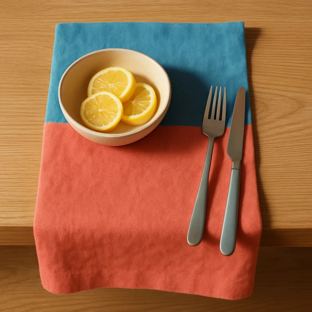
A vibrant palette inspired by a summer tablescape, perfect for a contemporary culinary brand identity.
The "modern culinary" brand identity draws inspiration from a vibrant tablescape, capturing the essence of contemporary dining with a fresh and appetizing color palette. This selection of colors embodies the dynamic and inviting nature of a modern culinary experience.
"Coral Rouge" serves as the primary color, energizing the brand with its bold and inviting tone, ideal for primary calls-to-action and active links. To complement this, "Cerulean Wave" is selected as the secondary color, adding a touch of sophistication for secondary buttons and highlights. "Lemon Zest," an accent color, brings a lively pop to icons and additional details, enhancing visual interest.
For the surface, "Sand Dune" provides a warm and neutral backdrop, perfect for card surfaces and page backgrounds, ensuring that content remains the focal point. "Slate Gray" is chosen for text, offering a clear and readable contrast on light surfaces, maintaining clarity across all communications.
When considering extensions or restraints on this palette, it is essential to maintain the vibrancy and clarity that define this brand identity. Expanding with additional colors should aim to complement the existing tones, while restraint should focus on preserving the core palette's balance and harmony.


