
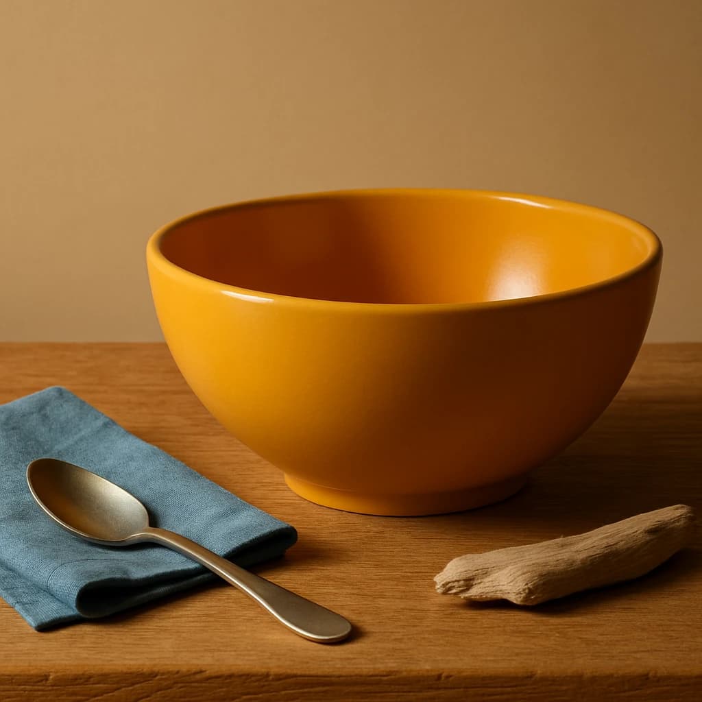
A curated color palette inspired by natural tones and textures, designed for a warm and inviting brand identity.
Inspired by natural tones and textures, this brand color system captures the essence of Warm Minimalism. The palette is designed to evoke a sense of comfort and sophistication, perfect for brands seeking a warm and inviting identity.
The primary color, Golden Ochre (#e09b32), serves as the focal point, drawing attention to primary calls-to-action and active links. It's a vibrant yet grounded hue that commands attention without overwhelming.
For a calming and cohesive backdrop, Sandy Beige (#f5e4ca) is chosen as the surface color. It provides a neutral canvas that complements the other tones, ideal for card surfaces and page backgrounds.
The secondary role is filled by Ocean Slate (#5a7b8c), a cool, understated blue that pairs well with the warmth of the primary color, perfect for secondary buttons and hover states.
Driftwood Gray (#c2b199) plays the neutral role, offering a subtle touch for borders and dividers, adding structure without distraction.
Finally, Deep Charcoal (#2f2e2b) is designated for text, providing the necessary contrast for readability on light surfaces, ensuring that communication remains clear and effective.
This palette is both versatile and adaptable, offering a balance of warmth and neutrality, suitable for a wide range of applications. Extend the palette with care, maintaining the harmonious balance that defines this identity.


