Discover a refined brand color system inspired by an elegant composition featuring deep blue and warm gold tones.
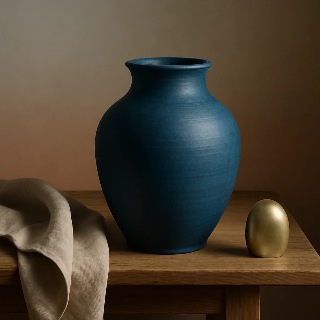
The brand identity "Elegant Minimalism" is crafted using a refined color palette gleaned from a sophisticated still life featuring a deep blue vase and golden elements. This palette is perfect for brands looking to convey a sense of understated luxury and quiet refinement.
Deep Cerulean serves as the primary color, prominent in CTAs and active links, providing a rich, calming foundation. Paired with Golden Ochre, this accent color brings warmth and attention to key elements, creating a harmonious balance between cool and warm tones.
Neutral tones like Taupe Linen are chosen for backgrounds and borders, offering a soft, unobtrusive backdrop that supports content without overshadowing it. Soft Sand forms the surface color, ideal for card interiors and background surfaces, enhancing the overall light and airy feel of the brand.
For text, Charcoal Ink is employed, ensuring readability and contrast against lighter surfaces without overwhelming the viewer. This palette is intentionally restrained, focusing on a few key colors to maintain elegance and avoid visual clutter.


