Discover Pixeliro's June 2026 Palette, blending vibrant energy with serene elegance through carefully curated colors.
The Pixeliro's June 2026 Palette embodies vibrant home aesthetics, merging vivid energy with serene elegance through a thoughtfully curated color system.
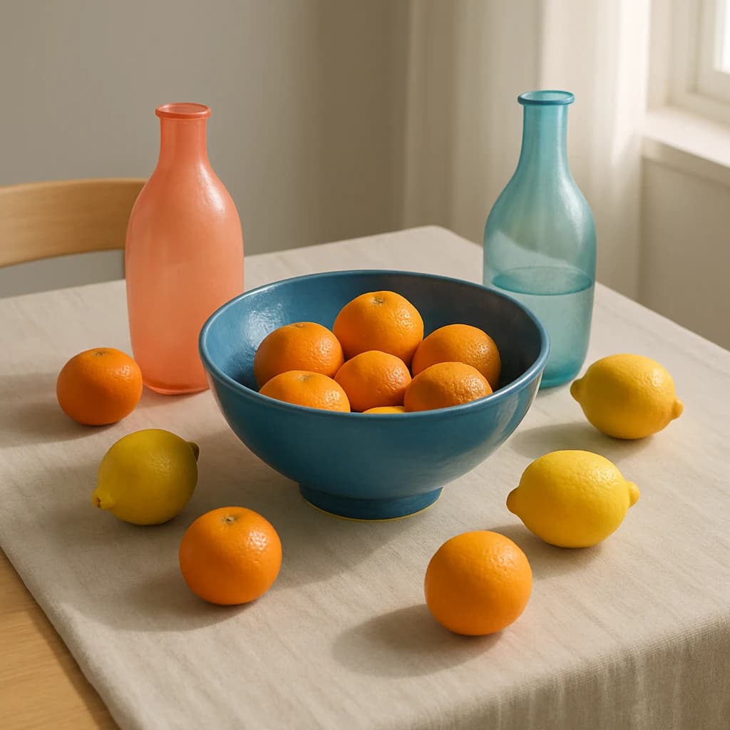
Rooted in the hue of "Oceanic Blue" (#007ea7), this primary color establishes a calming yet bold presence, ideal for primary CTAs and active links. It anchors the palette with a sense of trust and modernity.
For a dynamic contrast, "Citrus Burst" (#f28c28) serves as an accent, injecting energy into highlight elements and buttons. This vibrant hue captures the playful side of the palette, making it perfect for drawing attention.
"Peach Whisper" (#f4dac2) softens the composition as a secondary color. Its gentle tone is suited for secondary buttons and soft backgrounds, offering a soothing balance to the brighter elements.
"Lemon Cream" (#ffef94) functions as a neutral, providing a warm and inviting backdrop for backgrounds and card surfaces. It enhances readability while maintaining a light and airy feel.
The subtle elegance of "Canvas Linen" (#d4d4d4) enhances surfaces, creating a fresh and clean look for card surfaces and page backgrounds, complementing the brighter colors.
Finally, "Graphite Gray" (#4b4b4b) is employed for text, ensuring clarity and contrast on light surfaces. Its deep tone anchors the palette, making it versatile across various applications.
When designing with this palette, consider the balance between vibrancy and calm. Extend the palette by incorporating additional shades of blue or orange for a more diverse color scheme, or restrain it to focus on minimalism and clarity.


