
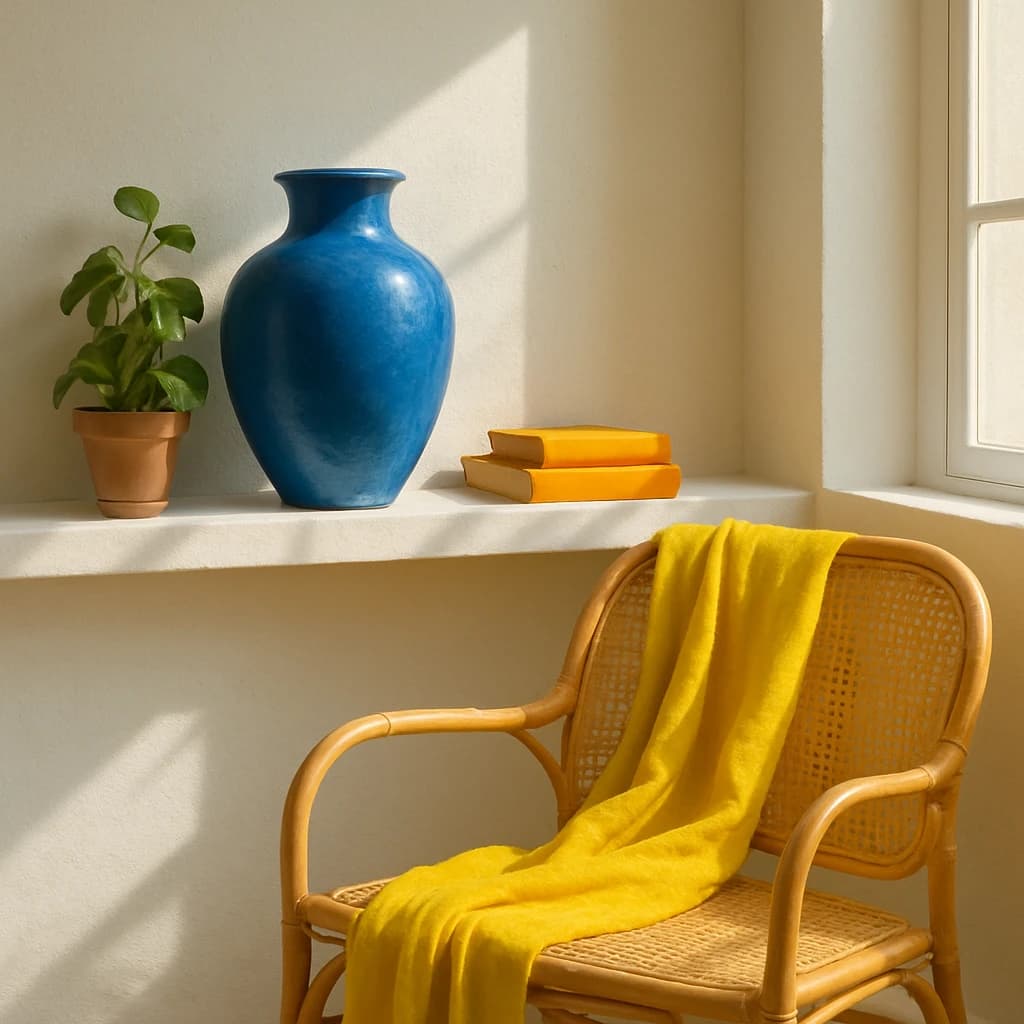
A curated blend of vibrant and earthy tones inspired by a serene interior scene, perfect for a tranquil home decor brand.
The August 2026 Palette of the Month for Pixeliro embraces a serene yet vibrant interior scene, crafting the essence of a tranquil home decor brand. This curated color system merges calming blues and sunny yellows with earthy neutrals, ideal for creating soothing yet lively environments.
Cerulean Vase (#3e77b1) serves as the primary color, infusing design elements such as CTAs and active links with a refreshing sense of calm and clarity. Its vibrant yet soothing hue makes it indispensable for primary interactions.
Golden Wrap (#f8d44c) acts as an accent, injecting warmth and brightness. This rich yellow is perfect for accent elements and highlights, offering a lively counterpoint to the cooler tones.
The Soft Sand (#e3e0d1) is the chosen surface color, providing a harmonious and gentle background for cards and pages. Its understated presence complements the more vibrant elements without overwhelming them.
For secondary roles, Rattan Cane (#d8b384) brings an organic touch to buttons and borders. It ties the palette together, adding depth and texture reminiscent of natural materials.
Leaf Green (#6b8e23) functions as a neutral, its subtlety perfect for backgrounds and minor text elements, grounding the palette with a hint of nature.
Finally, Rich Espresso (#3b2f26) is selected for text, ensuring readability against the lighter surfaces while adding a touch of elegance and depth.
This palette is both adaptable and cohesive, allowing for extension through additional earthy tones or restrained use to maintain simplicity and focus.


