Explore advanced color psychology in modern branding with innovative tactics, practical examples, and expert insights to enhance brand perception.
Understanding Advanced Color Psychology
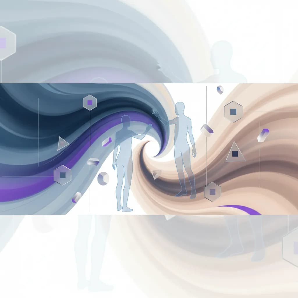
Advanced color psychology involves the nuanced understanding of how colors affect human perception and behavior beyond basic color associations. While traditional color psychology focuses on general emotions evoked by colors, advanced tactics delve into cultural, contextual, and psychological factors to create tailored brand experiences. For instance, the color #1DB954 (Spotify Green) is not just about vibrancy; it signifies modernity and energy, aligning with Spotify’s innovative and youthful brand image.
Modern brands leverage these deeper insights to craft identities that resonate on a psychological level, ensuring their message is not only seen but felt. This involves understanding color perception nuances across different demographics and psychographics to ensure the brand's color palette communicates the desired message effectively. As we move into a more personalized digital age, the role of advanced color psychology becomes increasingly crucial for brand differentiation and customer engagement.
Innovative Tactics for Modern Brands
To effectively apply advanced color psychology, modern brands must adopt innovative tactics that align with their core values and audience expectations. Here are some strategies to consider:
- Dynamic Color Palettes: Brands are now using dynamic color schemes that adjust based on user interaction or time of day. This approach not only enhances user engagement but also aligns with the user's psychological state, creating a more personalized experience.
- Cultural Sensitivity: Understanding cultural connotations of colors is vital. For example, while white symbolizes purity in Western cultures, it is associated with mourning in some Eastern cultures. Brands expanding globally need to adapt their color schemes to local preferences.
- Emotional Triggers: Colors can trigger specific emotions and actions. For instance, red can incite urgency, making it effective for call-to-action buttons. However, the context—such as the surrounding colors and the target audience—can modify this effect significantly.
By employing these tactics, brands can enhance their visual identity and create more meaningful connections with their audience. For practical implementation, designers can use tools like the Color Generator to explore harmony-based color schemes that align with their brand's psychological profile.
Case Study: Reimagining Brand Perception
Consider the rebranding of a well-known beverage company that sought to modernize its image. The brand moved from a traditional red and white palette to a more vibrant and diverse set of colors, incorporating shades of blue and green to signify freshness and innovation. This shift was not arbitrary; it was backed by extensive research into color psychology and consumer behavior.
The redesigned palette was carefully chosen to elicit feelings of excitement and modernity, aligning with the brand's new positioning as a forward-thinking leader in sustainability. The transition was not just visual but also emotional, with the colors enhancing the brand narrative and inviting consumers to engage on a deeper level.
Such strategic use of color can significantly alter brand perception, making it more relevant to contemporary audiences. This case study exemplifies the power of advanced color psychology in transforming brand identity and market positioning.
Tools to Implement Color Strategies
The successful application of advanced color psychology requires the right tools. Here are some that can aid in the development and execution of color strategies:
- Gradient Generator: This tool allows designers to create sophisticated gradients that transition seamlessly, perfect for adding depth and dynamism to brand visuals.
- Color Accessibility Check: Ensures that chosen color schemes meet accessibility standards, making the brand inclusive and ensuring a positive user experience for all.
- Brand Color Palette Generator: Helps in creating a complete color system from a primary color, ensuring consistency across all brand materials.
These tools empower designers and brand managers to create compelling and psychologically resonant color schemes that align with modern branding requirements.
Summary and Key Takeaways
Advanced color psychology offers modern brands a powerful avenue to enhance their identity and connect with audiences on a profound level. By understanding the complex interplay of colors, emotions, and cultural contexts, brands can craft visually and emotionally engaging experiences that resonate globally.
The adoption of innovative color tactics, supported by comprehensive tools, can transform how a brand is perceived and experienced. As the digital landscape continues to evolve, the strategic use of color will remain a critical component of effective brand communication.
Tip: Regularly review and adapt your brand's color strategy to reflect changes in consumer preferences and market trends.
To explore these strategies further and enhance your brand's color strategy, sign up to access advanced tools that can bring your vision to life.


