
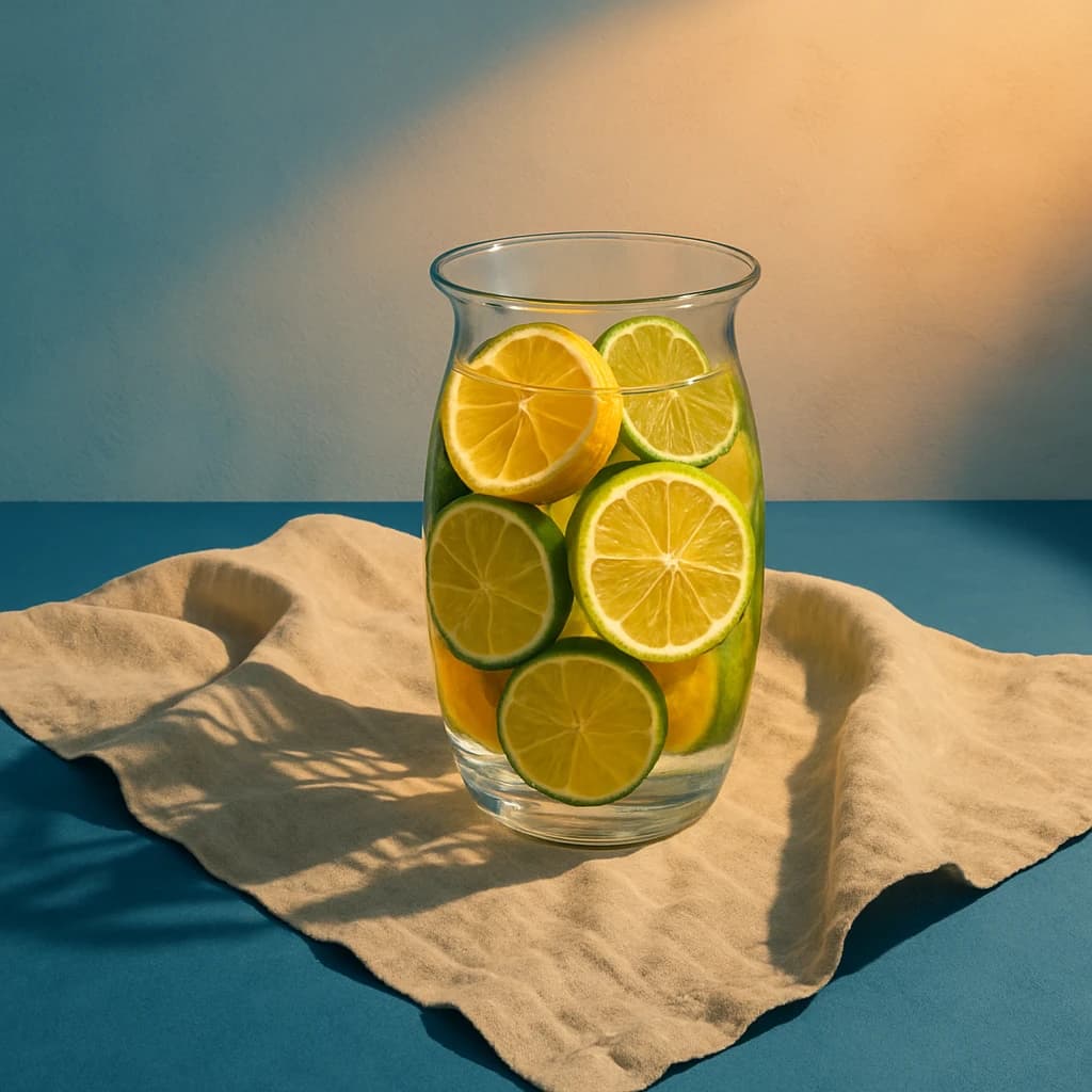
Explore a citrus-inspired palette that balances vibrancy and calm, perfect for modern UI/UX design.
August 2026 brings a refreshing blend of vibrant and calming hues, perfect for the evolving landscape of UI/UX design. This palette draws inspiration from the harmonious interplay of citrus tones and natural textures, offering a versatile spectrum for modern applications.
Lemon Zest (#f5c15c) commands attention with its bright and lively energy. Ideal for highlighting calls to action or important notifications, it brings a sunny disposition to any interface.
Lime Essence (#92c14b) introduces a burst of freshness, invigorating the user experience with its lively green. Perfect for buttons or interactive elements, it infuses vitality and engagement.
Sand Whisper (#d8c3a5) acts as a stabilizing force, grounding designs with its earthy tone. It’s an excellent choice for backgrounds, offering a calm and inviting base.
Ocean Depth (#3a6f98) adds a layer of sophistication and depth. Its cool, tranquil shade works beautifully for backgrounds or accent features, providing a serene backdrop that doesn’t overpower.
Creamy Linen (#f0e6da) softens the palette with its warm and comforting hue. Use it to highlight subtle text or create gentle transitions between elements, enhancing readability with a touch of elegance.
This palette melds vibrancy with tranquility, offering a cohesive approach to UI/UX design that is both engaging and soothing. Embrace these hues to craft interfaces that captivate and comfort your audience.


