Explore the calming palette of a Japanese zen garden, emphasizing harmony and balance.
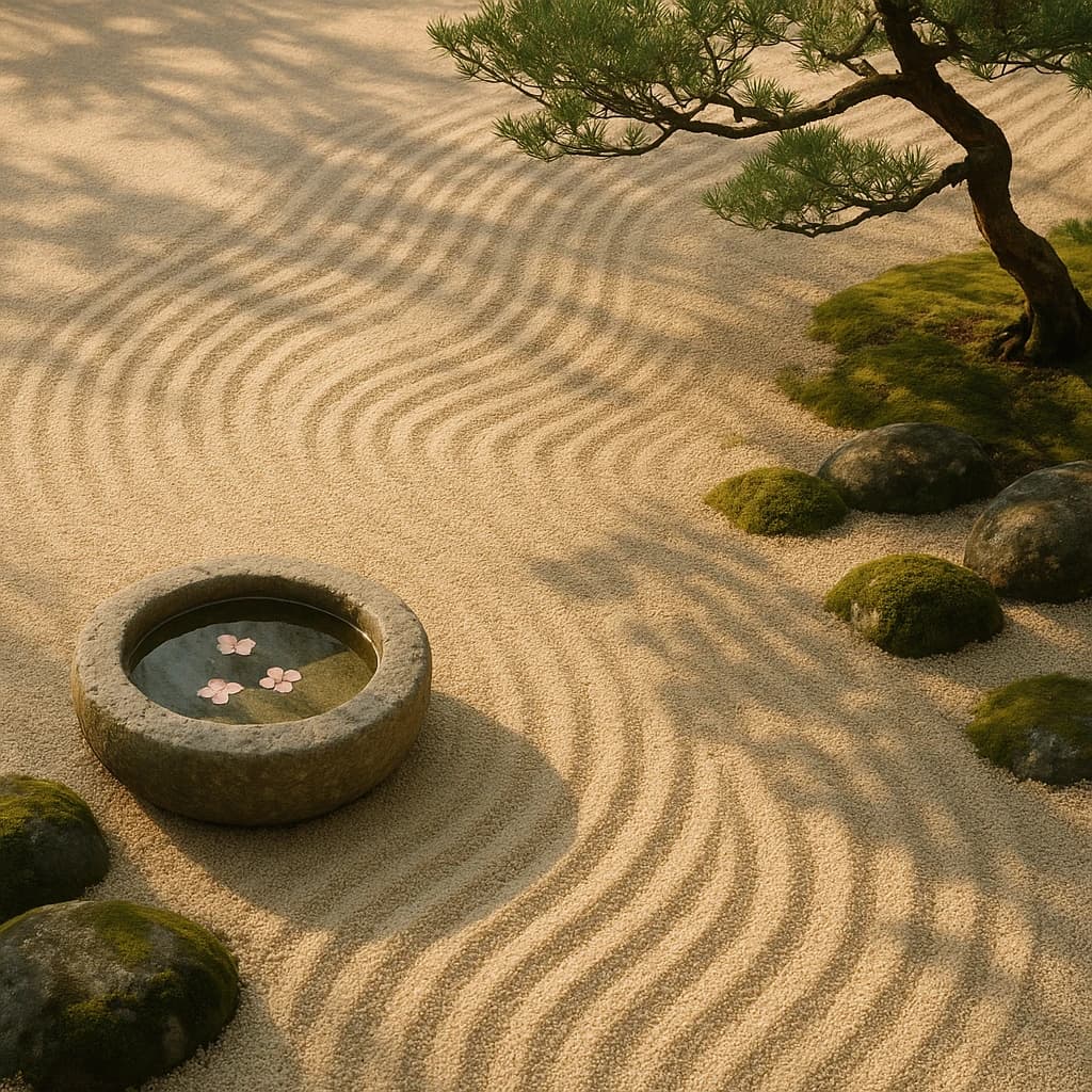
In the serene embrace of a Japanese zen garden, colors unfold with a gentle whisper, creating a harmonious balance between earth and sky. The palette is a meditation on simplicity, where each hue plays its role in fostering tranquility.
Sand Whisper anchors the scene with its soft beige, providing a calming backdrop reminiscent of raked sand patterns. This hue is pivotal for designers seeking to establish a foundation of peace and stability in their work.
Pinewood Tranquil introduces a muted brown, embodying warmth and earthiness. It adds depth and sophistication, making it ideal for accentuating natural elements in design.
Moss Veil emerges as a greenish-brown, weaving a narrative of growth and harmony with nature. Its presence is subtle yet significant, perfect for cultivating a sense of organic unity.
Pine Needle offers a refreshing contrast with its rich green, symbolizing life and vitality. This hue injects energy and freshness, ideal for invigorating minimalist compositions.
Petal Blush, a delicate pink, dances softly across the palette, suggesting elegance and grace. It serves as a gentle highlight, adding a touch of refined beauty without overwhelming the senses.
For designers, this palette is a lesson in restraint and balance, a reminder that simplicity can often yield the most profound beauty. Whether crafting spaces of meditation or products that invite calm reflection, these colors offer a pathway to tranquility.


