A curated color palette inspired by natural tones for a serene, artistic brand identity.
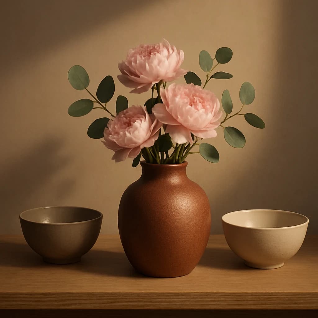
The color palette for "Serene Arrangement" embodies a serene artistry identity, drawing from natural tones to create a harmonious brand experience. This palette is designed to evoke a sense of calm and refined elegance, perfect for brands in the creative and artisanal sectors.
The primary color, Terracotta Clay (#ab6454), serves as the anchor of the brand, providing warmth and inviting users to engage with primary calls-to-action and active links. Its earthy tone is complemented by Blush Petal (#e1bab5), a gentle secondary hue used for secondary buttons and highlights, adding a soft, romantic touch.
For accents, Eucalyptus Green (#49654d) is selected to provide a refreshing contrast, perfect for accent elements and hover states. This green adds a touch of nature and vitality, making it ideal for drawing attention in subtle ways.
The surface color, Ivory Sand (#f0e7d8), is chosen for its ability to provide a clean and neutral background, ensuring content stands out on card bases and overall surfaces. This light, sandy tone exudes sophistication and balance.
Lastly, Earthy Taupe (#8a7a69) is selected as the text color, offering excellent readability on light surfaces. Its muted tone maintains the overall tranquil and cohesive feel of the palette.
This color system is versatile yet restrained, allowing for extension into additional accents or neutrals if needed while maintaining a consistent brand voice.


