A curated palette embodying serene pastel elegance.
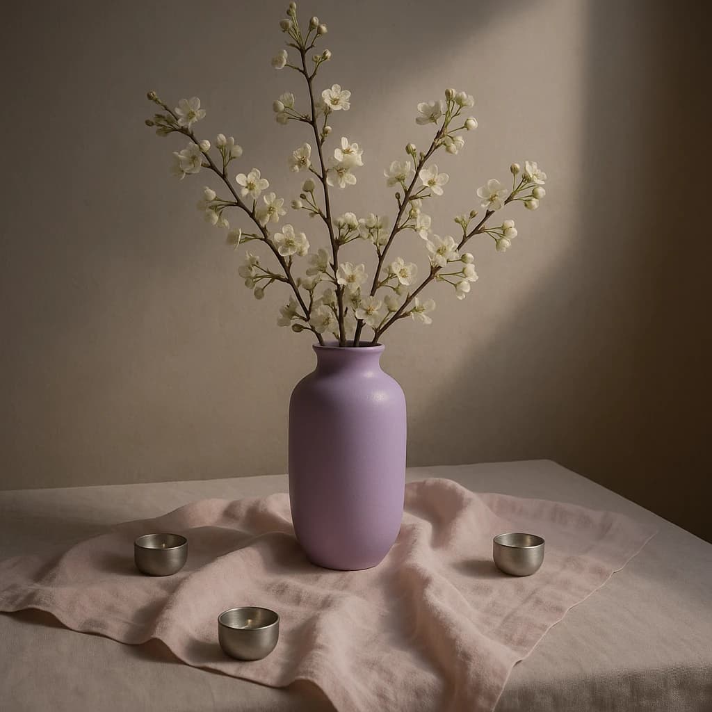
The "Serene Pastel Arrangement" brand palette captures an essence of calm and subtle sophistication. This collection of hues is drawn from soft and muted tones, balancing delicacy with a touch of warmth.
For the primary color, Lavender Haze (#c9a9d1) is selected to drive engagement through primary CTAs and active links, providing a gentle yet captivating focal point. The surface role is fulfilled by Soft Petal (#e9e0dc), creating a serene canvas for card surfaces and page backgrounds, offering a harmonious backdrop.
Warm Sand (#d3c4b7) serves as the secondary color, ideal for secondary buttons and subtle highlights, adding depth and warmth. Ivory Mist (#f2f2f0) is the neutral choice, perfect for integrating into backgrounds and dividers, maintaining a clean and airy space.
Lastly, Muted Bark (#a08a86) is chosen for text, ensuring readability and a soft contrast on light surfaces.
This palette is versatile, suitable for brands seeking a tranquil and elegant aesthetic. Extension of this palette should be done cautiously, maintaining the soft and muted characteristics that define its serene identity.


