Explore a palette that marries vibrant hues with soothing neutrals, perfect for contemporary UI/UX design.
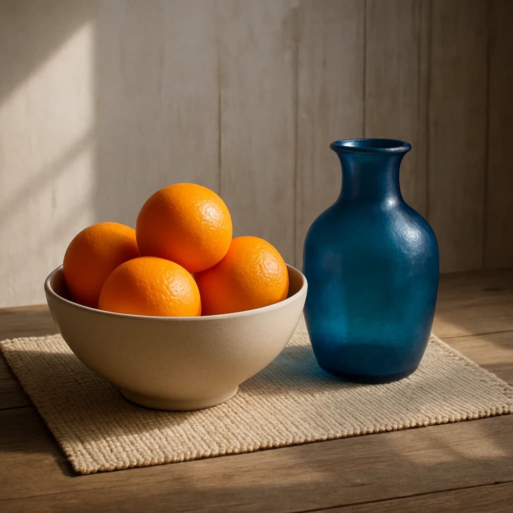
The "Rustic Harmony" palette is a sophisticated blend of vibrant and neutral tones, perfectly tailored for modern UI/UX design. Each color serves a distinct purpose, ensuring a harmonious and engaging user interface.
- Clementine Burst (#f28c28): This vibrant hue infuses designs with energy and warmth. It's ideal for call-to-action buttons or interactive elements that need to stand out and drive user engagement.
- Ocean Glass (#2d5c88): A cool, calming shade that provides depth. Use it for backgrounds or navigation bars to create a serene and trustworthy environment.
- Sandstone Whisper (#d3c8b4): A gentle neutral that balances the palette. Perfect for backgrounds or typography, it ensures readability while maintaining a soft aesthetic.
- Earthy Umber (#8a6e3c): This grounding color is excellent for accents or borders, adding a touch of nature and stability to the design.
- Ivory Sheen (#e0dbc8): Offering a delicate backdrop, this shade enhances the sense of space and lightness, making it a great choice for large areas or to increase visual breathing room.
Overall, "Rustic Harmony" offers a versatile and inviting palette, fostering a balance between vibrancy and tranquility, essential for captivating and user-friendly digital experiences.
Comments
Sign in to leave a comment


