Harness the vibrant tones of "Sunlit Radiance" for a UI/UX palette that energizes and captivates. Explore bold yellows, grounded sands, and refreshing blues.
In the dynamic realm of UI/UX design, color plays a pivotal role in user experience and engagement. The "Sunlit Radiance" palette encapsulates the essence of summer with its vivid and refreshing hues, perfect for crafting interfaces that captivate and energize.
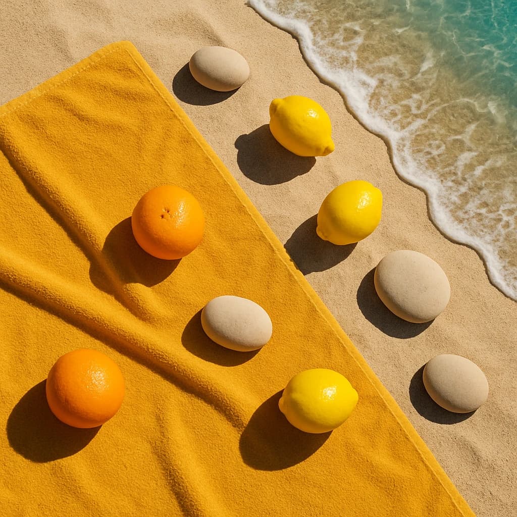
Golden Citrus (#f5a623) serves as the palette's powerhouse, infusing any design with a sense of vitality and warmth. It's a perfect choice for call-to-action buttons that demand attention and inspire interaction.
Lemon Zest (#f8e71c) takes on the role of an accent color, its bright and fresh quality ideal for highlighting key features or notifications, ensuring they stand out.
Sandy Shore (#f5deb3) offers a warm, neutral backdrop that calms and balances the more vibrant tones. Its presence enhances readability and provides a seamless user experience.
Ocean Breeze (#00a3e0) introduces a refreshing contrast with its cool and clear essence. It's well-suited for backgrounds and secondary elements that require a touch of tranquility and clarity.
Lastly, Pebble Beige (#d2b48c) grounds the palette with its earthy stability. Use it for text or subtle dividers, ensuring a harmonious flow throughout the design.
This palette is a celebration of summer's vibrant energy, offering designers the opportunity to create interfaces that are not only visually striking but also intuitively engaging.


