Explore a palette inspired by the tranquil hues of a serene coastal sunset, perfect for invoking calm and balance in design.
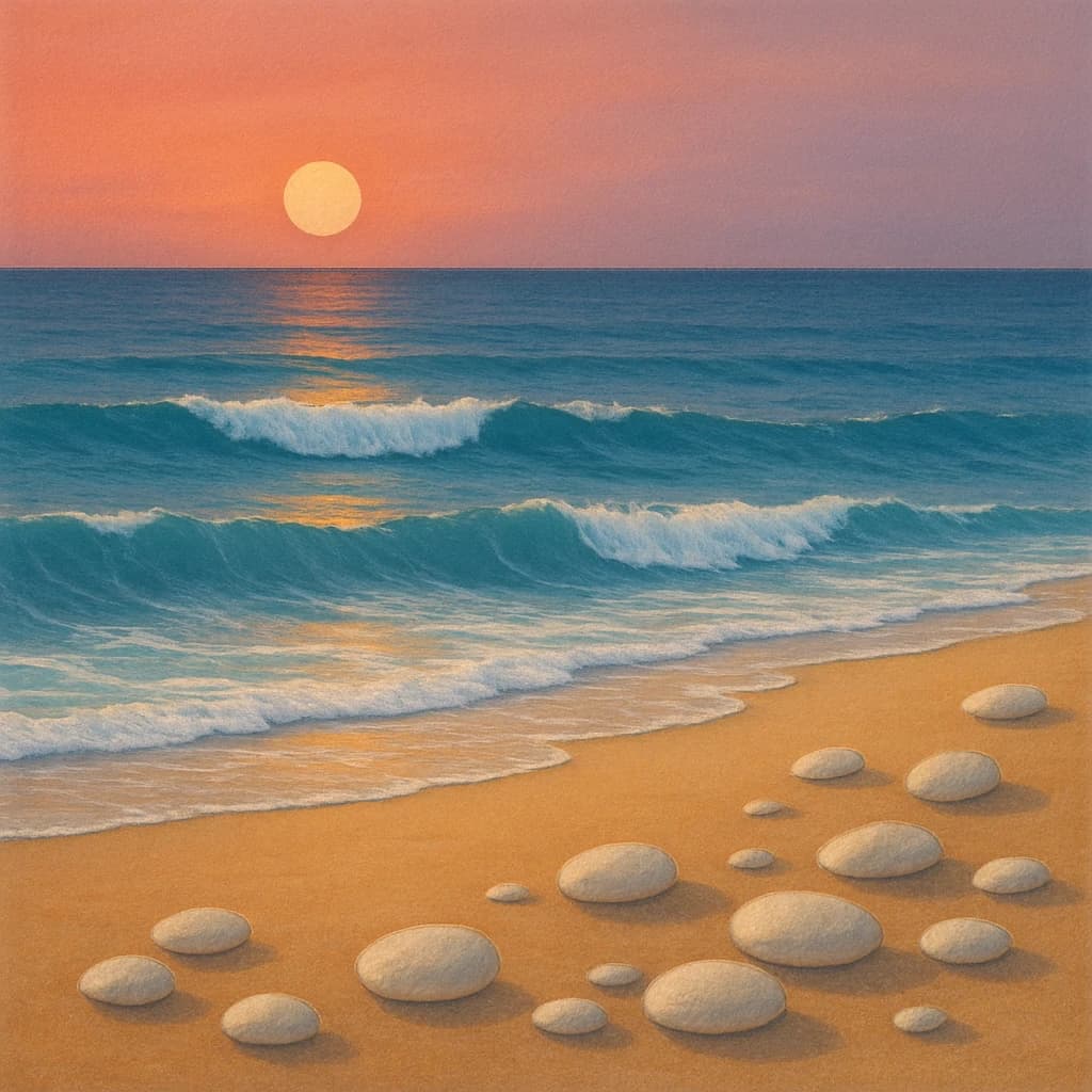
The "Ethereal Coastline" palette captures the tranquil essence of a serene beach at sunset, where the sky meets the sea in a harmonious blend of colors. This collection of hues embodies a perfect balance of warmth and coolness, creating a soothing visual experience.
Sunset Blush (#f3a994) serves as the warm anchor, reminiscent of the sun's gentle embrace as it dips below the horizon. This shade brings comfort and serenity, ideal for spaces intended for relaxation and reflection.
Oceanic Teal (#0088a9) adds depth and tranquility, echoing the vastness of the ocean. It’s perfect for designs seeking to evoke calmness and a sense of open space.
Golden Sand (#f7d7a0) offers a grounding base with its warm, earthy tone. It’s an excellent choice for creating a relaxed and inviting atmosphere, reminiscent of a sunlit beach.
Wave Crest (#c7d8e9) injects a soft, airy quality, suggesting movement and freshness. This hue invigorates spaces, making it ideal for areas that benefit from a touch of vitality.
Pebble White (#ffe9c7) closes the palette with its gentle neutrality, providing balance and harmony. Use it to highlight or create calm, cohesive spaces.
This palette is a designer’s toolkit for crafting environments that prioritize tranquility and balance, blending warmth with cool tones to evoke the serene beauty of nature.


