Explore a serene palette combining earthy tones and vibrant citrus, ideal for tranquil and balanced designs.
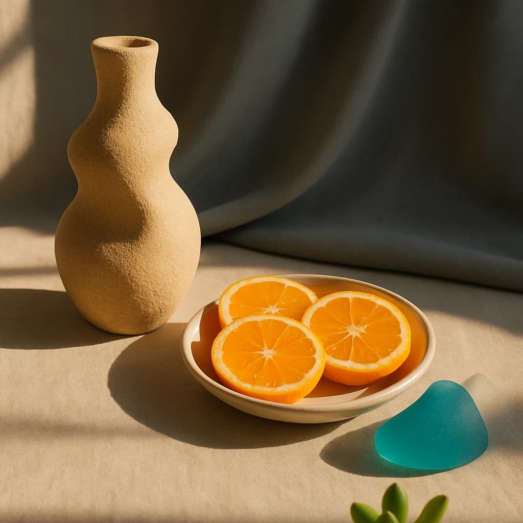
The palette extracted from this scene is a delicate balance of warmth and vibrancy, perfectly suited for designs that speak to both tranquility and invigoration. The dominant Sandstone Whisper (#d2b48c) brings an earthy, grounding presence. Its warm undertones offer stability and comfort, making it ideal for backgrounds or foundational design elements.
Accentuating this is the lively Citrus Burst (#f68b2c), a hue that commands attention with its vibrant energy. This color is perfect for focal points or to add a splash of zest in branding elements, ensuring immediate engagement and vitality.
Contrasting beautifully is the serene Ocean Breeze (#5fa8d3). This calming blue introduces a refreshing coolness, evoking open skies and tranquil seas. It's well-suited for creating serene moods in digital interfaces or wellness-focused branding.
Completing the palette is Ivory Drift (#f5f0e6), a soft neutral that enhances light and space, offering a gentle and unobtrusive backdrop. It's perfect for minimalist designs where subtlety is key.
This palette is a visual symphony of calm and vigor, ideal for projects that require a harmonious blend of relaxation and energy.


