Dive into a vibrant palette inspired by natural elements and citrus zest.
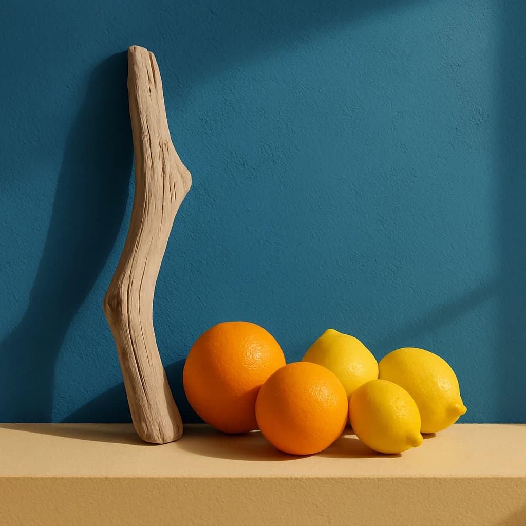
Explore the vibrant fusion of hues in this refreshing palette, where nature's elements meet citrus zest. The Oceanic Teal (#2d6f8b) serves as a calming backdrop, reminiscent of tranquil seas, providing depth and serenity to the overall composition. Its cool undertones make it ideal for spaces that require a soothing atmosphere.
Adding a burst of energy, Lemon Zest (#f5b700) invigorates with its bright, cheerful presence. This hue is perfect for injecting life into branding or interior spaces, encouraging a sense of optimism and vitality. Complementing this is the Tangerine Burst (#f07818), a warm and inviting color that stimulates creativity, making it an excellent choice for design elements that demand attention and enthusiasm.
To balance the vibrancy, Sand Drift (#d8c0a8) introduces a soft, neutral tone, grounding the palette with its earthy presence. This subtle shade provides harmony and is ideal for backgrounds or larger surfaces where a subdued elegance is desired.
Finally, Driftwood Beige (#b3987d) ties the palette back to nature, adding texture and a sense of organic connection. Its understated charm complements the more vivid colors, making it suitable for accent pieces or design elements that require a natural touch.
This palette is a celebration of bold contrasts and harmonious blends, perfect for designers seeking to create dynamic yet balanced compositions.


