Explore a cyberpunk palette that balances futuristic neon with organic warmth, perfect for creating immersive, dynamic designs.
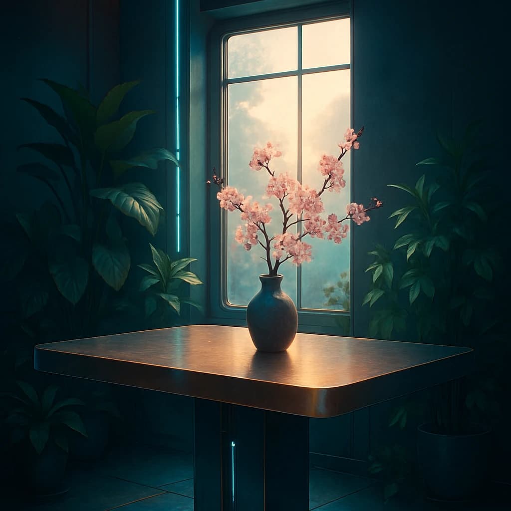
Immerse yourself in the juxtaposition of urban futurism and natural serenity with this cyberpunk palette. The dominant Midnight Teal (#273c4f) serves as a tranquil backdrop, reminiscent of a city at rest, enveloping the scene in a deep, calming embrace. This hue is ideal for backgrounds in digital interfaces, lending an air of mystery and depth.
In contrast, Soft Apricot (#ffd9b1) introduces a gentle warmth, akin to a soft sunrise amidst the neon glow. This hue can be used to highlight text or interface elements, providing a welcoming contrast to the darker tones.
Verdant Calm (#7fc8a9) infuses the palette with a touch of nature, bringing a refreshing, organic quality. Ideal for accentuating eco-friendly products or services, it bridges the gap between technology and nature.
Dotted throughout are hints of Blush Petal (#ffb8c6), adding a tender, romantic note. This color works beautifully for decorative elements, softening the overall cyberpunk aesthetic with its gentle charm.
Finally, Burnished Copper (#b48648) adds an industrial sheen, reflecting the gritty yet stylish nature of the theme. Use this hue for metallic textures or to accentuate structural elements, enhancing the futuristic vibe.
Together, these colors create a harmonious balance between the digital and the organic, offering designers a versatile palette for creating immersive, dynamic environments.


