Explore the delicate balance of Soft Harmony, where gentle hues evoke tranquility and timeless elegance.
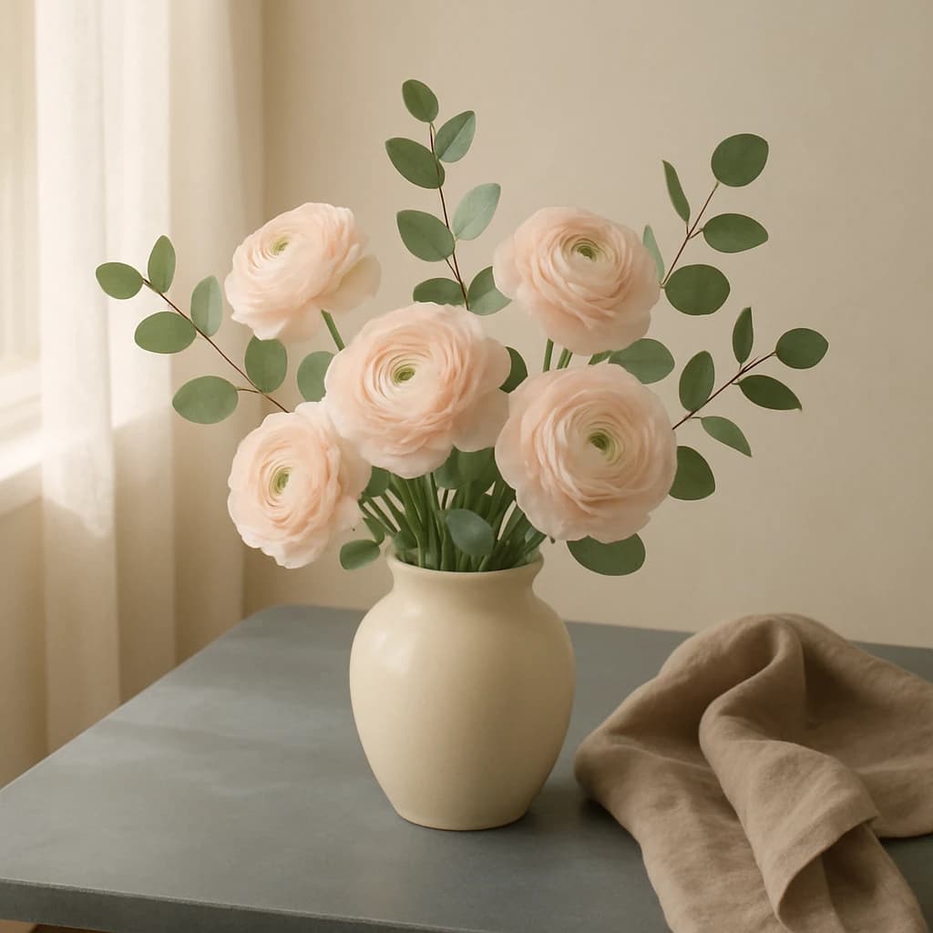
In the gentle embrace of Soft Harmony, colors weave together to evoke a serene yet elegant mood. The palette is led by Blush Petal (#f3e4d5), a delicate tone that infuses designs with warmth and a touch of romance. This hue is ideal for branding that seeks to connect emotionally with its audience, inviting a sense of calm and approachability.
Sandy Linen (#c2b8a0) follows, grounding the palette with its neutral stability. It acts as a versatile background or accent, adding sophistication without overshadowing other elements. Complementing these is Eucalyptus Leaf (#9fae94), a refreshing green that introduces a natural balance. Its presence rejuvenates and harmonizes, making it perfect for eco-friendly or wellness brands.
The palette is anchored by Ivory Vase (#e0d4c4), a subtle off-white that embodies purity and simplicity, enhancing minimalist designs with its understated elegance. Finally, Slate Table (#7a8272) provides depth, offering a muted contrast that enriches the overall composition without dominating it.
- Use Blush Petal for headers or primary elements to draw attention softly.
- Incorporate Sandy Linen and Ivory Vase for background or secondary elements to maintain a clean, cohesive look.
- Add Eucalyptus Leaf for a fresh, natural accent.
- Employ Slate Table for text or detailing to create visual interest and depth.


