
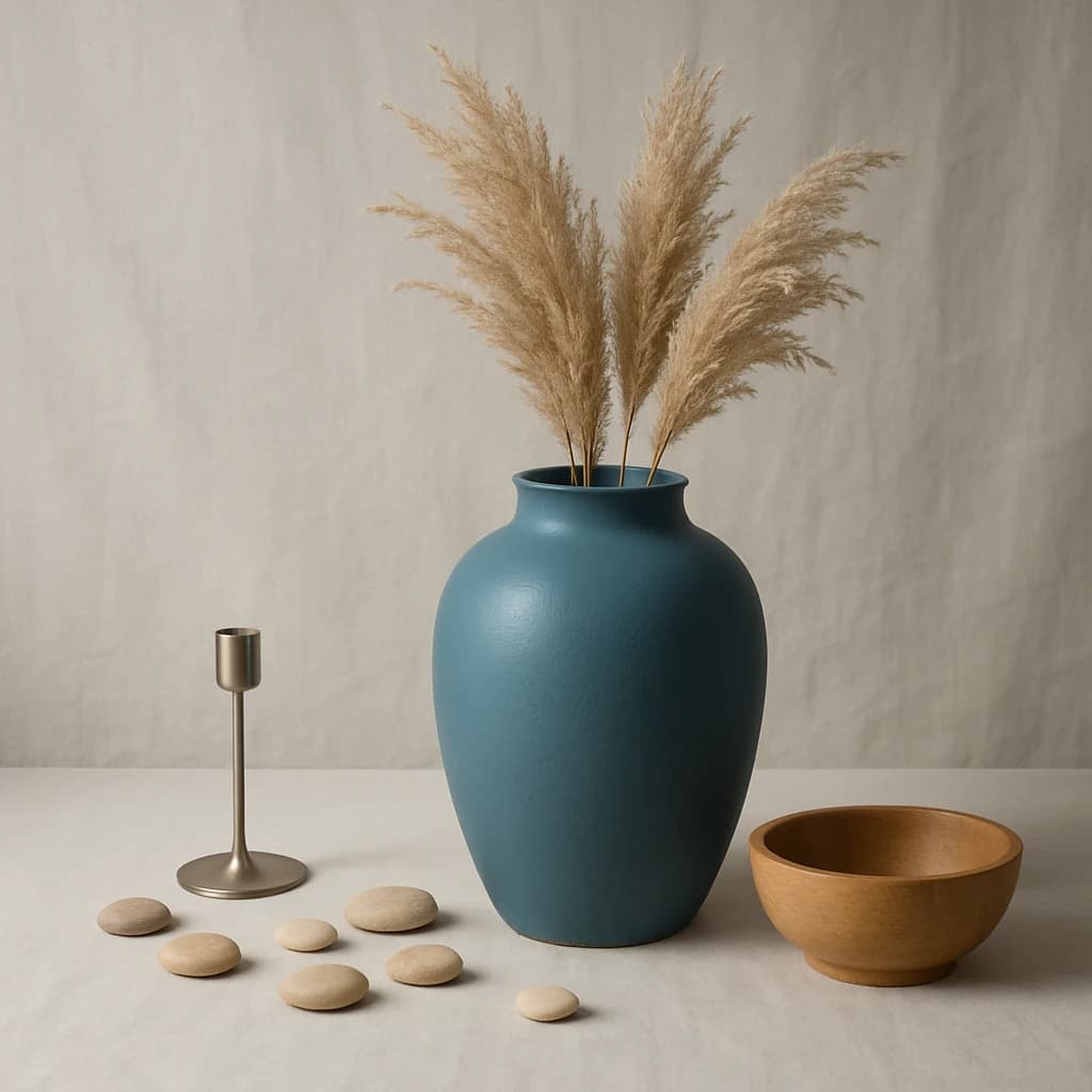
Discover the curated brand color palette for a "minimal elegance" aesthetic, drawing inspiration from natural textures and serene hues.
Introducing a refined color palette inspired by the theme of "minimal elegance." This curated selection of hues is drawn from natural elements, conveying a serene yet sophisticated aesthetic.
The primary color, Ocean Slate (#467a89), serves as the cornerstone of this brand identity, ideal for primary call-to-action elements and active links. It evokes a sense of calm while remaining visually striking.
Desert Sand (#e1ceb5) is chosen as the surface color. It brings warmth and subtlety, perfect for card surfaces and page backgrounds, creating an inviting and cohesive space.
For secondary elements, Clay Taupe (#b8a18d) adds depth and complements the primary color. Its muted tone is suitable for secondary buttons and hover states, ensuring a harmonious interaction design.
As an accent, Earthy Umber (#7e6f5f) introduces a touch of grounding sophistication. Use it sparingly for icons and small graphical elements to maintain visual interest without overpowering the design.
Finally, Pure White (#ffffff) is selected for text on dark surfaces, offering clarity and readability. Its simplicity ensures that content remains the focal point.
This palette embodies a minimalist elegance, ideal for brands seeking a timeless and understated visual language. Use this color system to maintain consistency, only extending the palette when additional differentiation is essential.


