
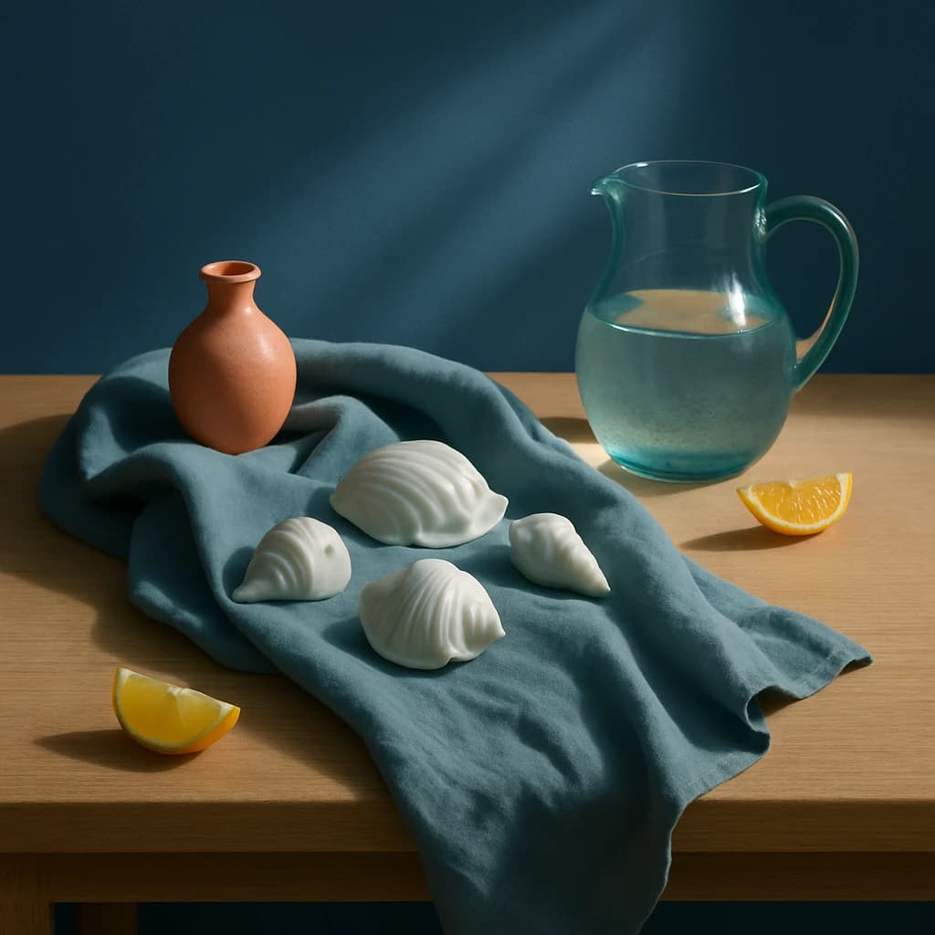
Explore a serene and sophisticated palette with "Azure Still Life," combining calming blues with natural accents for premium editorial design.
The brand identity for this week's color selection is "Serene Editorial." This palette draws inspiration from calming, coastal visuals, with a focus on harmonizing blues and natural tones to create a tranquil yet sophisticated design atmosphere.
"Ocean Mist" (#5b7b98) serves as the primary color, ideal for primary CTAs and active links, ensuring they stand out while maintaining an elegant appearance. Complementing this, "Seashell White" (#d9e3ea) acts as the surface color, providing a clean, airy background for cards and pages, enhancing readability and focus.
For accents, "Terracotta Glow" (#e49b72) introduces a warm, earthy contrast, perfect for buttons and interactive elements that require user attention. Meanwhile, "Citrus Burst" (#f5c372) is designated for secondary elements like highlights and notifications, adding a vibrant touch without overwhelming the design.
"Coastal Slate" (#8daab5) functions as the neutral tone, suitable for navigation bars and borders, offering a subtle yet distinct separation between sections. Finally, "Deep Sea Ink" (#3d4c5b) is chosen for text, ensuring clarity and readability against the lighter surfaces.
This palette is designed to be versatile, adaptable to various editorial contexts, and can be extended with additional shades for more complex design systems, while maintaining a serene and cohesive visual experience.


