
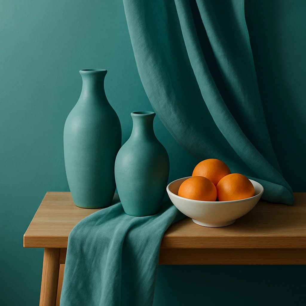
A curated brand palette inspired by serene teal and vibrant orange hues, perfect for a modern home decor brand.
This curated color palette captures the essence of modern home decor, balancing between serene teal tones and vibrant orange accents. The selection is perfect for a brand that emphasizes tranquility and style within living spaces.
Ocean Teal serves as the primary color, offering a calming and sophisticated hue that is ideal for primary call-to-action buttons and active links. Its versatility makes it a staple in the brand’s identity, providing a consistent visual anchor.
The Citrus Burst accent hue injects energy and draws attention to specific elements like buttons and highlights. This vibrant orange stands out against the more subdued tones, ensuring important information and actions are easily noticeable.
For neutral elements, Mist Gray provides a soft, unobtrusive background that complements the bolder hues without overpowering them. It’s perfect for areas that require subtlety, like backgrounds and borders.
Almond Cream is designated for surfaces, offering a warm and inviting canvas for card surfaces and page backgrounds. This color provides a gentle contrast to the primary and accent colors while maintaining an overall cohesive look.
Finally, Charcoal Slate ensures readability and clarity for text on light surfaces. Its deep, rich tone guarantees that body text remains legible and visually appealing.
This palette is well-balanced for a modern aesthetic, with room to expand or refine when exploring additional product lines or seasonal themes.


