
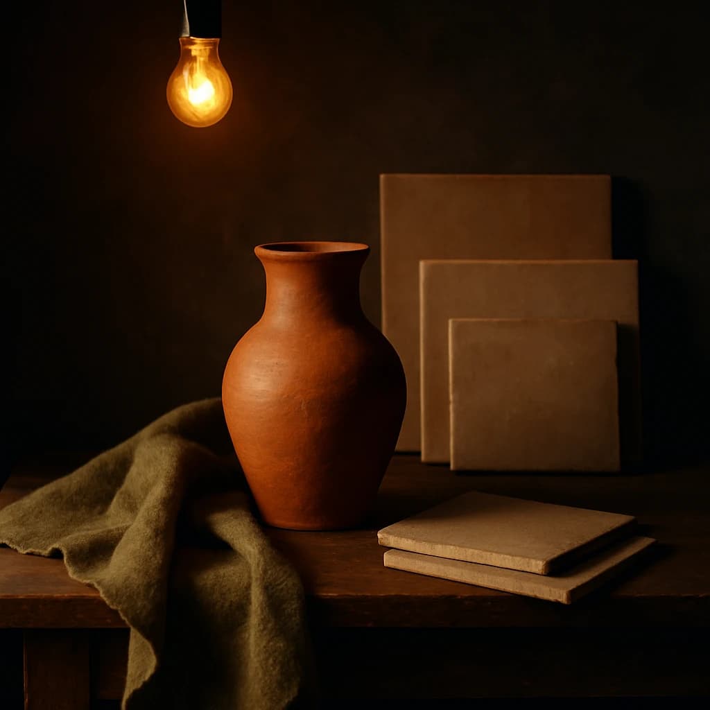
Explore the rustic elegance of the 'Earthen Harmony' palette, where warm, muted tones create a cozy and timeless atmosphere for UI/UX design.
The 'Earthen Harmony' palette is a celebration of rustic elegance, bringing together warm, muted tones that evoke a sense of timelessness. This palette is perfect for UI/UX designers looking to create interfaces that feel both inviting and grounded.
Dominating the palette is Terracotta Clay (#8c4b2e), a warm and earthy hue that captures the essence of traditional craftsmanship. This color serves as an excellent foundation, offering warmth and familiarity that draws users in.
Complementing this is Olive Moss (#5e5631), which adds depth and a natural touch. This hue is ideal for backgrounds or accents, providing a serene, landscape-inspired feel that can calm and focus the user.
Burnt Sienna (#735f45) introduces additional warmth, perfect for creating cozy and inviting spaces within your design. It pairs beautifully with softer tones while maintaining a strong, grounding presence.
For a rich, foundational base, Rustic Umber (#4a3a2c) is indispensable. Its deep tones provide a timeless quality, anchoring elements and adding sophistication to your layout.
Finally, Amber Glow (#f4c77a) infuses the palette with light and vibrancy. This hue is perfect for highlighting key elements, offering gentle contrast while maintaining the palette's cohesive warmth.
Use this palette to craft designs that are both modern and rooted in natural beauty, perfect for applications seeking to convey authenticity and comfort.


