
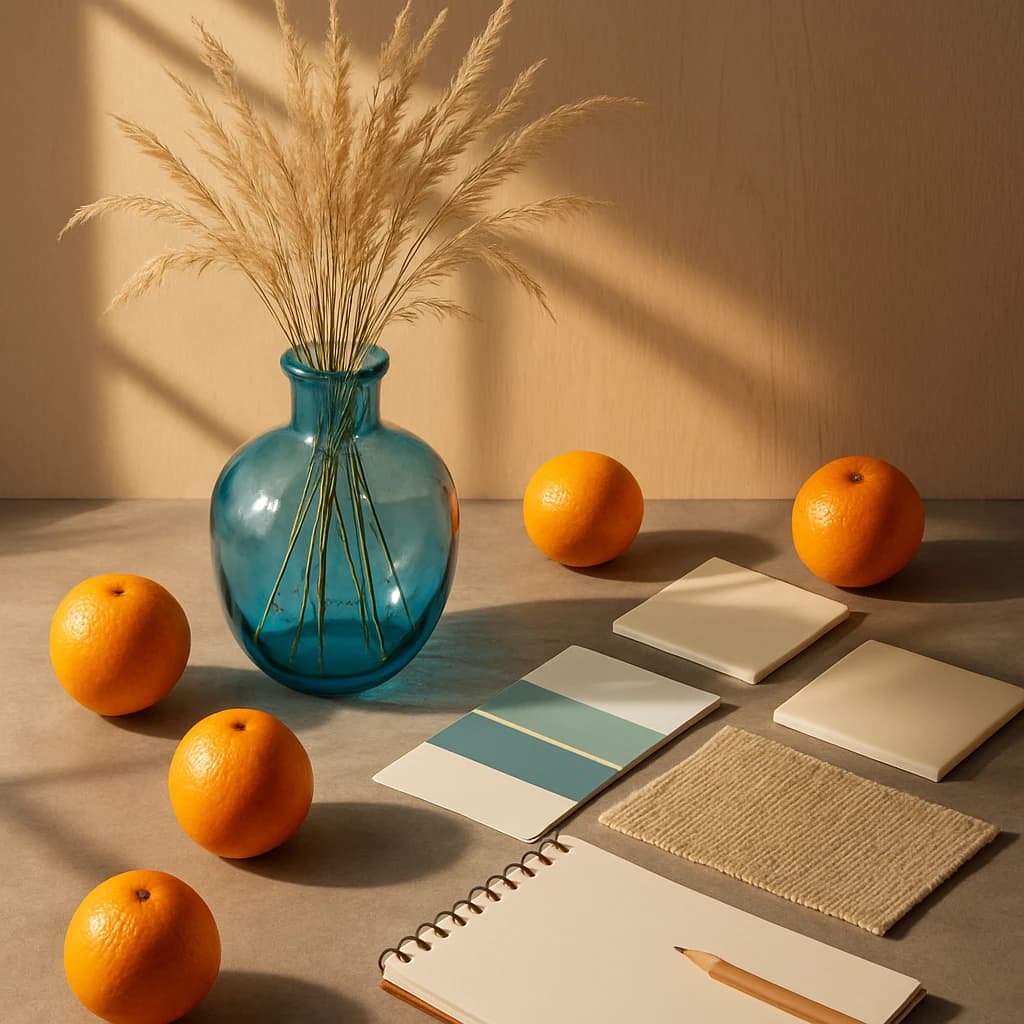
Explore a calming and vibrant palette that balances warmth and serenity, ideal for minimalist UI-UX design.
August 2026 brings a palette that harmonizes vibrancy with tranquility, ideal for UI-UX designs that seek to engage and soothe. This collection of hues is perfect for those looking to create interfaces that are both inviting and calming.
- Amber Citrus (#f4a200) - This vibrant hue infuses energy and warmth, making it a prime choice for call-to-action buttons or highlights that need to grab attention without overwhelming.
- Oceanic Teal (#007ea7) - A color that evokes calm and reliability, Oceanic Teal is suited for backgrounds or elements that need to convey trust and stability.
- Sand Dune (#f1e5c0) - With its soft, neutral tone, Sand Dune creates a clean, minimalist base, suitable for text areas or content blocks that demand clarity.
- Pale Sky (#b4ccd4) - Offering a sense of openness, Pale Sky is ideal for creating airy spaces within a design, enhancing the feeling of freedom and lightness.
- Driftwood Beige (#d9c3a1) - This earthy hue grounds the palette, adding warmth and depth to neutral designs, perfect for backgrounds or borders.
Incorporate this palette into your projects to balance vitality with serenity, creating user experiences that are both engaging and restful.
Comments
Sign in to leave a comment


