
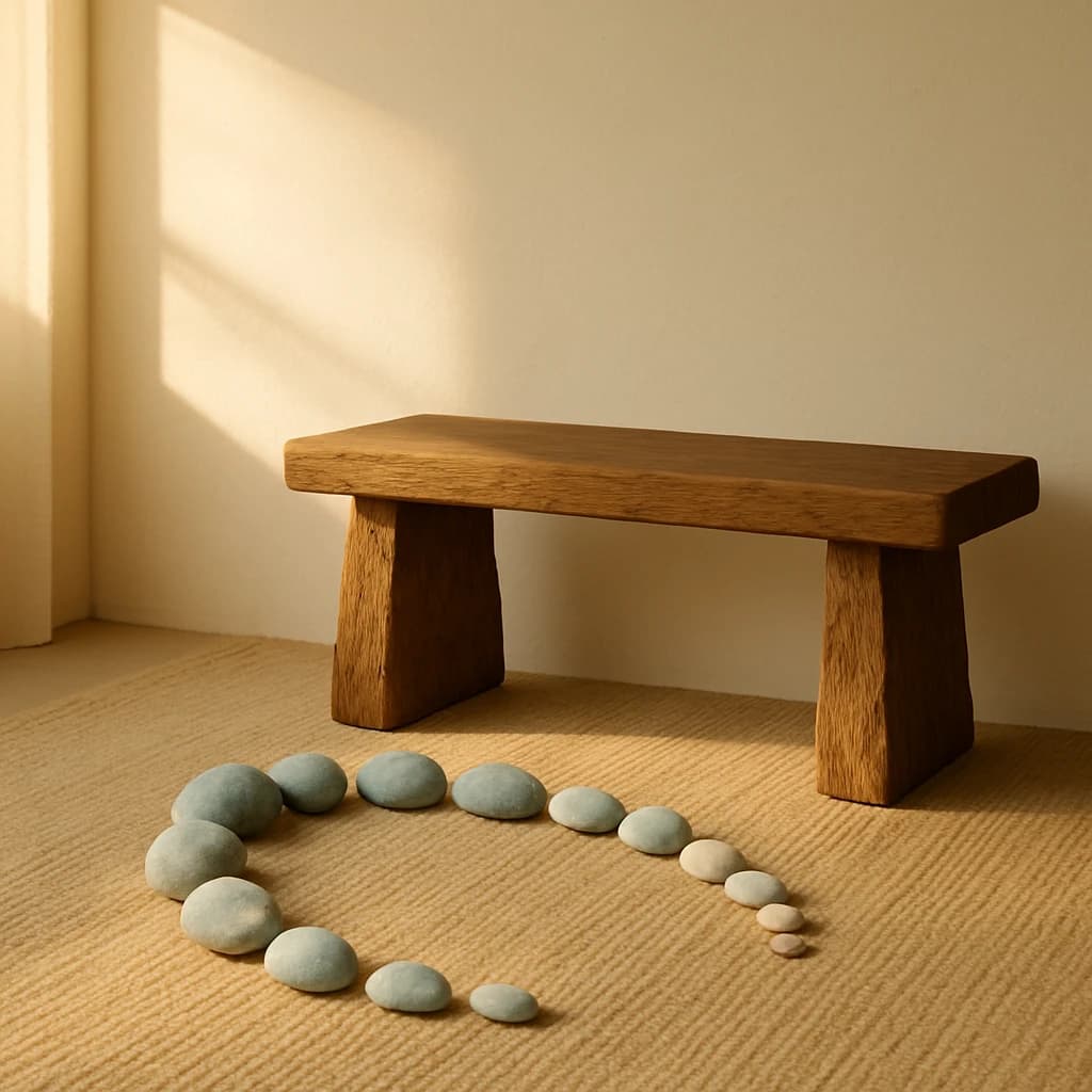
Explore the serene and grounding palette for your next UI/UX project.
Embrace the grounded elegance of nature with this serene color palette, perfect for creating calming and balanced UI/UX designs. The palette draws inspiration from earthy tones and muted greens, offering a sense of stability and natural warmth.
Desert Beige (#c7a880): This hue dominates with its warm, grounding presence, making it ideal for backgrounds that need to convey stability and calm. Use it to create a soothing atmosphere in interface designs.
Timber Tan (#a57c4e): Bringing a touch of rustic authenticity, this shade adds depth and earthiness. It's perfect for accent elements or typography that requires a natural touch.
Sandstone Whisper (#d5c8b0): Soft and elegant, this color enhances minimalistic designs. Utilize it for subtle highlights or secondary elements that need to stand out gently.
Pebble Sage (#c5ccc7): A muted green that offers tranquility and balance, ideal for buttons or icons that guide users with a gentle touch.
Incorporate these hues to craft interfaces that breathe calmness and elegance, resonating with users seeking a connection with nature. This palette is tailored for designs aiming for timeless appeal and serene functionality.


