
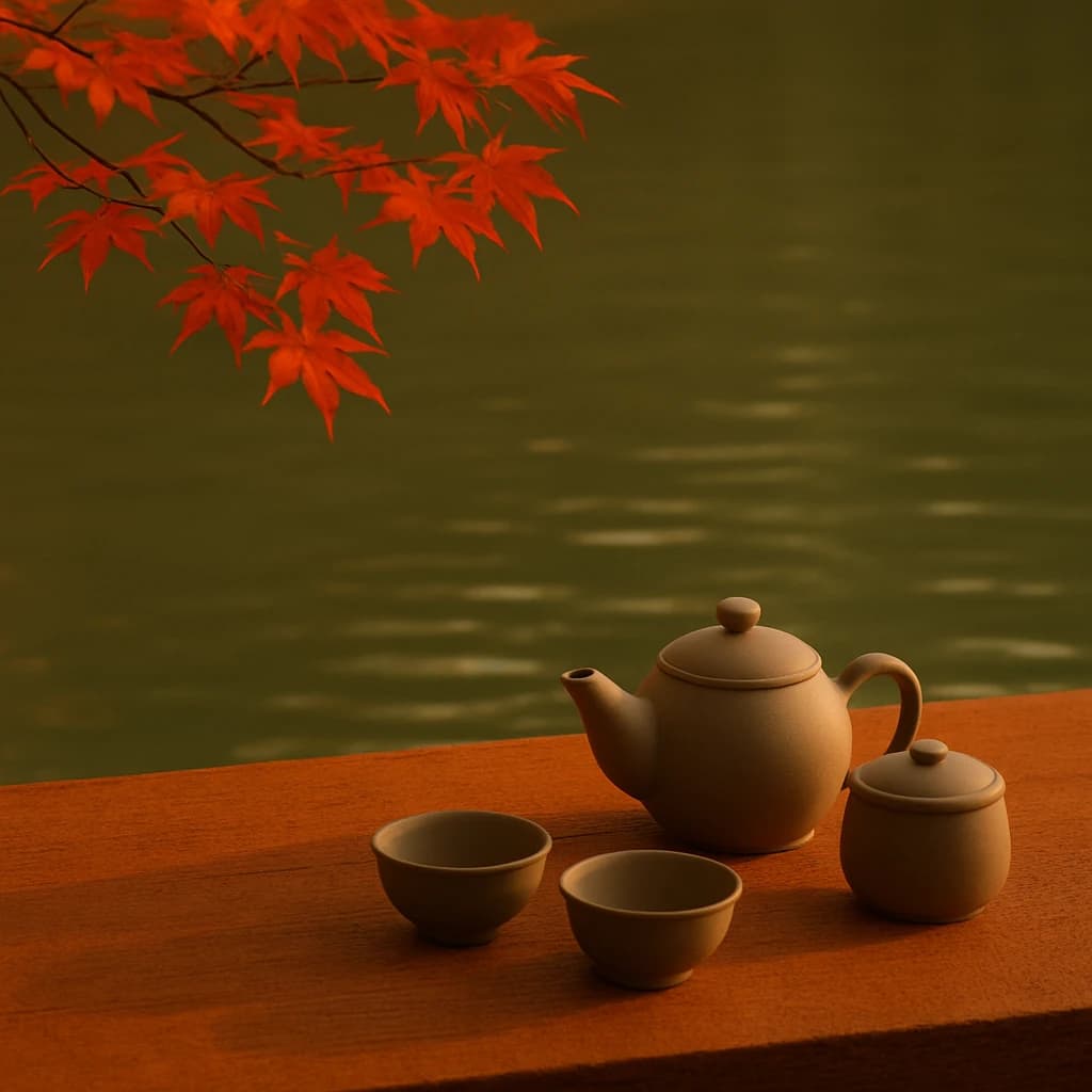
Explore the Japanese-inspired palette reflecting tranquility and tradition.
In the tranquil embrace of September, our Japanese-inspired palette emerges, capturing the serene elegance of traditional aesthetics. This palette harmonizes nature's transition with cultural simplicity, offering a meditative escape into color.
Autumn Ember (#d94f29) dominates the scene with its vibrant warmth. This fiery hue, reminiscent of falling leaves, symbolizes change and transformation. It is ideal for designs aiming to convey energy and renewal.
Earthy Clay (#7e6c39) offers a grounding balance. Its rich, earthy tones suggest stability and craftsmanship, perfect for adding depth to branding or interior design projects.
Verdant Whisper (#556b2f) introduces a soothing touch of nature. This muted green speaks of tranquility and growth, suitable for wellness or eco-conscious designs.
Bamboo Beige (#c7a17a) is soft and understated. It complements the bolder hues while adding an element of sophistication, ideal for minimalist or traditional design themes.
Shadowed Stone (#3b3a30) anchors the palette with its dark mystery. Use it to create contrast and focus, enhancing the depth of lighter colors.
This palette is a testament to the beauty of simplicity and nature's rhythm, inviting designers to explore its harmonious balance.


