
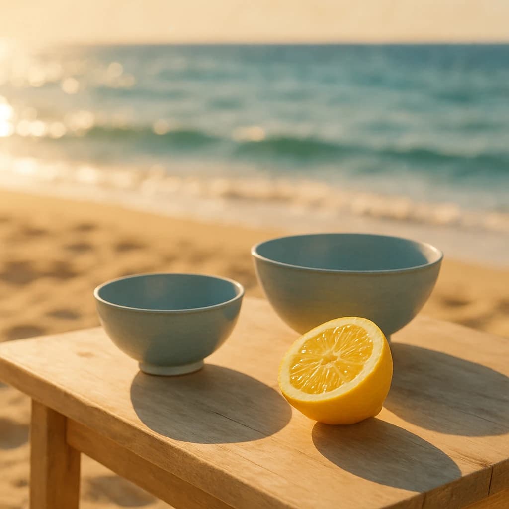
Discover a serene palette inspired by the tranquil hues of a Japanese beach scene, perfect for creating calm and inviting designs.
The August 2026 palette draws inspiration from a Japanese coastal scene, infusing spaces with tranquility and warmth. It's a harmonious blend of soft and inviting hues, perfect for serene and balanced designs.
Honeyed Sand (#f4c87a) dominates with its soft, warm embrace, reminiscent of sunlit beach sands. Use it to evoke warmth and create welcoming environments.
Ocean Whisper (#bdd2db) introduces a calm, soothing presence. This blue is ideal for instilling tranquility and complementing natural elements.
Sunset Luster (#e9e0b8) adds depth with its gentle glow, capturing the essence of a setting sun. It's perfect for adding warmth and sophistication to any design.
Citrus Burst (#ffde75) offers a lively contrast, bringing energy and freshness. Use it sparingly to accentuate focal points and invigorate compositions.
Aqua Mist (#a5b5b4) rounds out the palette with a subtle, cooling touch, reminiscent of sea breezes. This hue is perfect for balancing the warmth and introducing calm.
- Design Usage: Ideal for creating spaces that require a balance of warmth and tranquility.
- Hints: Combine these hues in residential or hospitality interiors for a serene, inviting atmosphere.


