
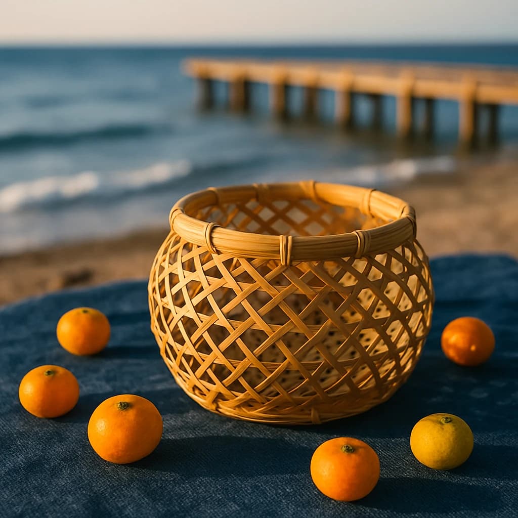
Explore a serene Japanese summer palette, blending deep ocean blues with warm, earthy tones.
In July 2026, the Japanese summer palette unfolds a narrative of tranquility and natural beauty. At the forefront, Ocean Whisper (#36658a) dominates with its deep, serene blue, reminiscent of calm seas and endless horizons. It sets a peaceful foundation, inviting introspection and relaxation.
Complementing this, Golden Bamboo (#d8a24e) brings warmth and tradition, evoking the craftsmanship of woven baskets. This hue is ideal for adding an earthy, artisanal touch to designs, grounding them in nature.
Sunlit Citrus (#f4c542) introduces a burst of vibrant energy, akin to the bright summer sun and ripe fruits. Its lively presence can infuse any composition with zest and vitality, making it perfect for highlights and accents.
Harbor Mist (#62829e) offers a softer, muted blue, enveloping spaces with calmness and contemplation. This shade works beautifully in backgrounds or to create harmonious transitions.
Finally, Evening Indigo (#3f4966) captures the quiet elegance of twilight, adding depth and sophistication. It is ideal for creating contrast and highlighting focal points.
- Use Ocean Whisper for a serene backdrop, enhancing meditation apps or relaxation spaces.
- Incorporate Golden Bamboo in branding to convey tradition and warmth.
- Sunlit Citrus is perfect for energizing call-to-action buttons or summer campaigns.
- Harbor Mist can soften interfaces, creating an inviting, peaceful user experience.
- Evening Indigo serves as a sophisticated anchor, enriching designs with depth.


