
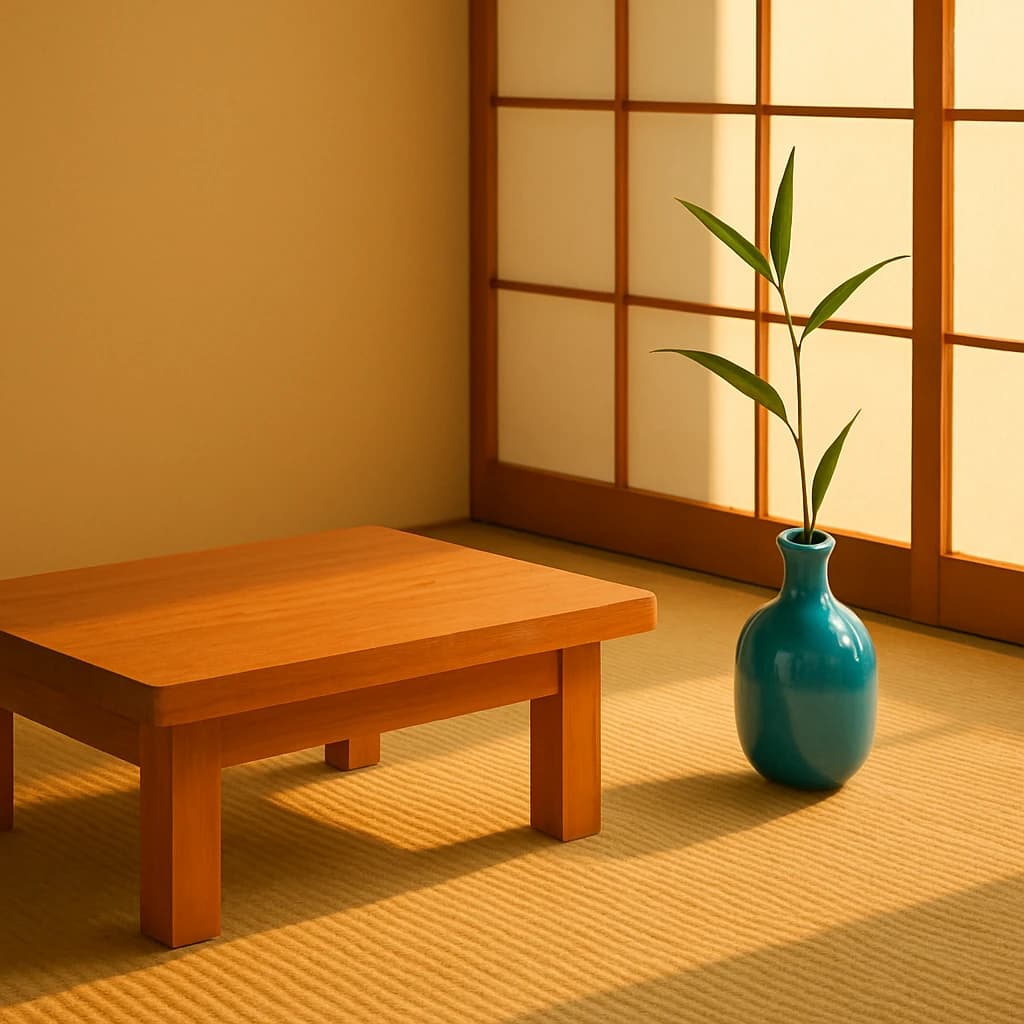
Explore the tranquil hues of a Japanese-inspired color palette, perfect for minimalist and serene design aesthetics.
The Japanese-inspired palette is a study in serene simplicity, rooted in natural elements and tranquil hues. At its core is Golden Amber (#d4a55d), offering a warm, grounding presence reminiscent of traditional tatami mats. This hue serves as a foundation, enveloping spaces in a comforting glow.
Ivory Whisper (#f6e9d9) plays a subtle yet essential role, providing a gentle contrast to darker tones. It is the quiet whisper of serenity that balances the vibrancy of other colors, ideal for expansive backgrounds or minimalist designs.
The introduction of Aqua Tranquil (#8ac0c9) adds a splash of refreshing coolness, akin to clear waters. This color is perfect for accents that require a calming influence, bringing clarity and focus to the forefront.
Finally, Verdant Leaf (#426f4d) injects a breath of nature into the composition. This green signifies life and renewal, offering a lively punch that can be used to highlight features or create focal points within a design.
- Use Golden Amber for warm, inviting interiors.
- Apply Ivory Whisper for peaceful, expansive backgrounds.
- Incorporate Aqua Tranquil for refreshing accents.
- Embrace Verdant Leaf for natural vibrancy.


