
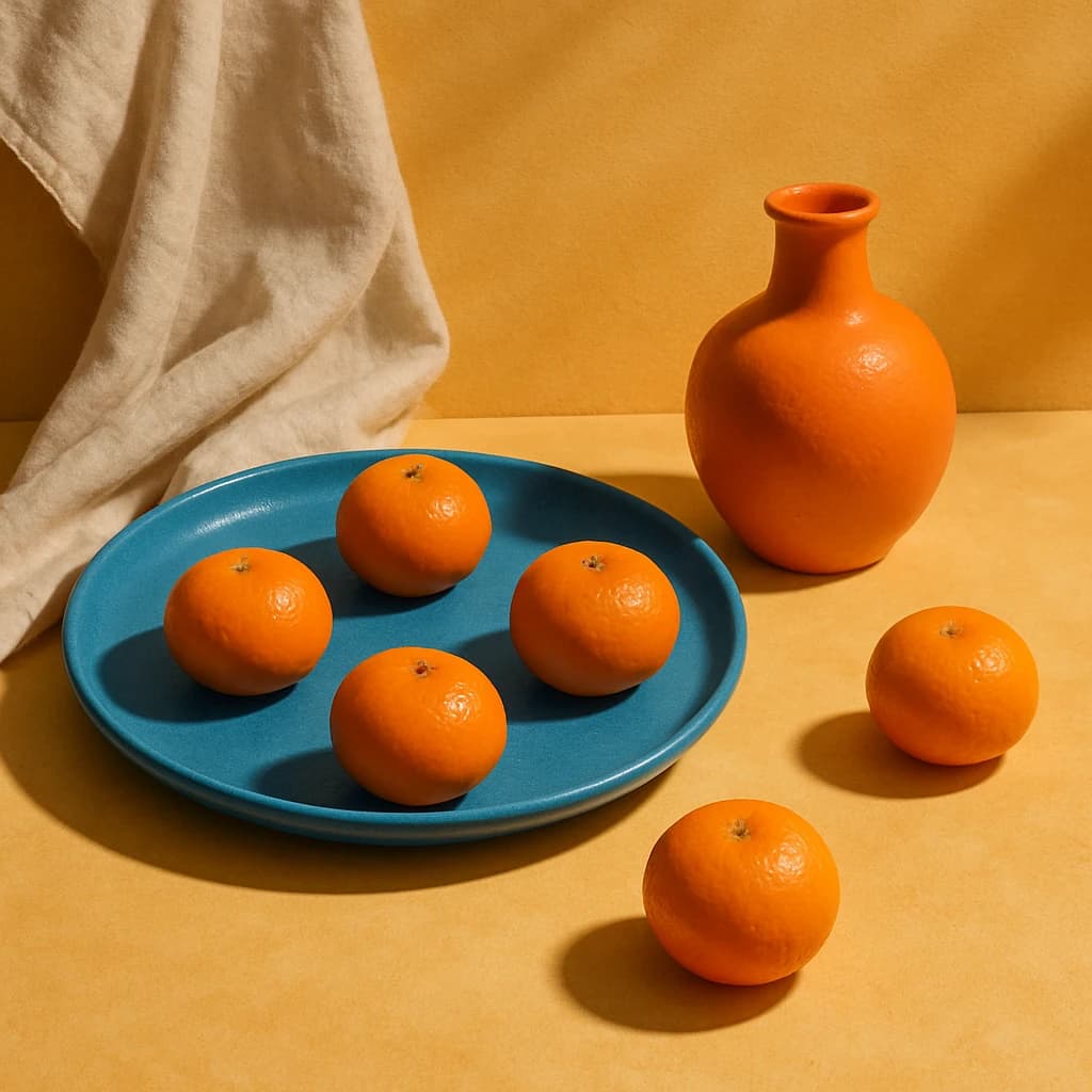
Explore the vibrant interplay of hues in this striking palette, perfect for bold and balanced design.
The palette unfolds with a vibrant energy, led by Clementine Dream (#f39c12). This hue radiates warmth and positivity, making it perfect for infusing spaces with a lively atmosphere.
Complementing this is Spiced Ember (#e67e22), adding depth and an invigorating touch. It's ideal for accentuating designs with bold strokes and dynamic contrasts.
Teal Whisper (#16a085) enters as a soothing counterpoint. Its calm, serene undertones offer a refreshing balance to the vibrant oranges, making it essential for achieving harmony.
Finally, the palette is grounded by Ivory Veil (#f7f3e9), a gentle, soft tone that provides a neutral base. It allows the brighter colors to stand out while maintaining an overall sense of balance and cohesion.
- Use Clementine Dream for focal points and energetic highlights.
- Incorporate Spiced Ember in dynamic elements for added intensity.
- Balance with Teal Whisper for calm and coherence.
- Employ Ivory Veil as a backdrop to enhance clarity and focus.


