
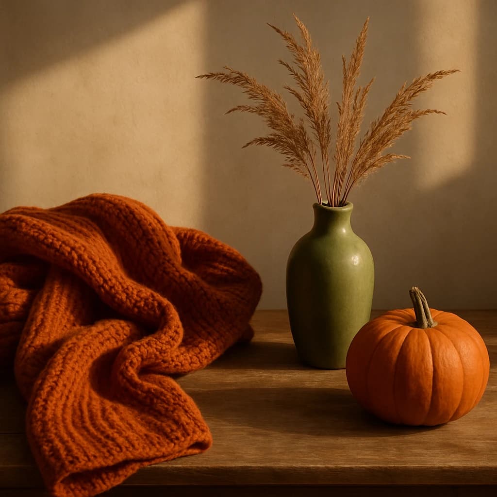
Dive into rich autumnal hues with Burnt Pumpkin and Olive Canopy, perfect for fall branding.
As the crisp air of September sets in, the palette shifts to embrace the warmth and richness of autumn. This season, the Burnt Pumpkin (#b05326) dominates as a bold, cozy hue that invites warmth and depth into your branding. It's the color of comfort, perfect for creating inviting spaces and products that resonate with fall's inherent coziness.
Harvest Wheat (#9d8e73) complements this with its rustic elegance, grounding the palette with a touch of nature. Its muted tones work well in backgrounds or as a secondary color to add depth without overwhelming the primary design elements.
Olive Canopy (#8c9b6b) introduces an earthy serenity, ideal for brands looking to evoke a sense of calm and connection to nature. This hue is versatile, working beautifully in both foreground and accent roles for a harmonious, natural look.
Cinnamon Dust (#d1a87d) spices up the palette with subtle vibrancy, enhancing the autumnal feel. It's a perfect accent for highlighting features or creating a warm, inviting ambiance in your designs.
Rounding off the palette, Soft Taupe (#c5bca9) offers a neutral canvas, balancing the more vibrant hues with understated sophistication. It's an excellent choice for backgrounds, allowing other colors to pop while maintaining a cohesive, elegant aesthetic.
- Use Burnt Pumpkin for bold statements and primary branding elements.
- Incorporate Harvest Wheat for subtle, grounding backgrounds.
- Integrate Olive Canopy in nature-themed designs for a calming effect.
- Accent with Cinnamon Dust to add warmth and spice.
- Employ Soft Taupe as a neutral base to unify the palette.


