
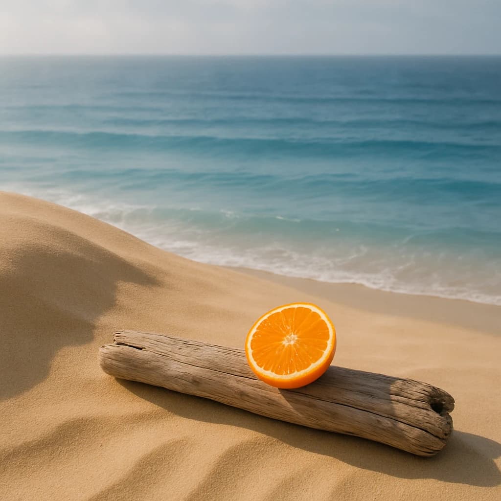
Explore the serene interplay of hues from a tranquil beach scene, perfect for branding that evokes calm and vitality.
The Coastal Serenity Palette is a harmonious blend of nature-inspired hues that captures the tranquility of a beach scene. Each color tells a unique story, evoking both calmness and energy, making it ideal for branding that seeks to connect with audiences on an emotional level.
Desert Sand (#f4d6a6) serves as the palette's foundation, offering a warm and stable backdrop reminiscent of sun-kissed dunes. This hue is perfect for designs that aim to convey reliability and comfort.
Ocean Breeze (#77a3b8) introduces a sense of refreshment and calm, much like the gentle waves of the sea. Its soothing qualities are well-suited for projects that wish to inspire serenity and exploration.
The vibrant Citrus Burst (#ff922b) injects a lively energy into the mix. This zesty hue is excellent for accents, drawing attention and infusing enthusiasm into any design.
Completing the palette is Driftwood Grey (#c5b097), a soft neutral that offers balance and depth. Its subtle presence ensures that it complements the brighter tones without overshadowing them.
Incorporate these colors into your branding to evoke a sense of tranquil vitality, perfect for lifestyle, wellness, and travel sectors. The interplay of these hues promises to engage and inspire, making them a versatile choice for creative endeavors.


