
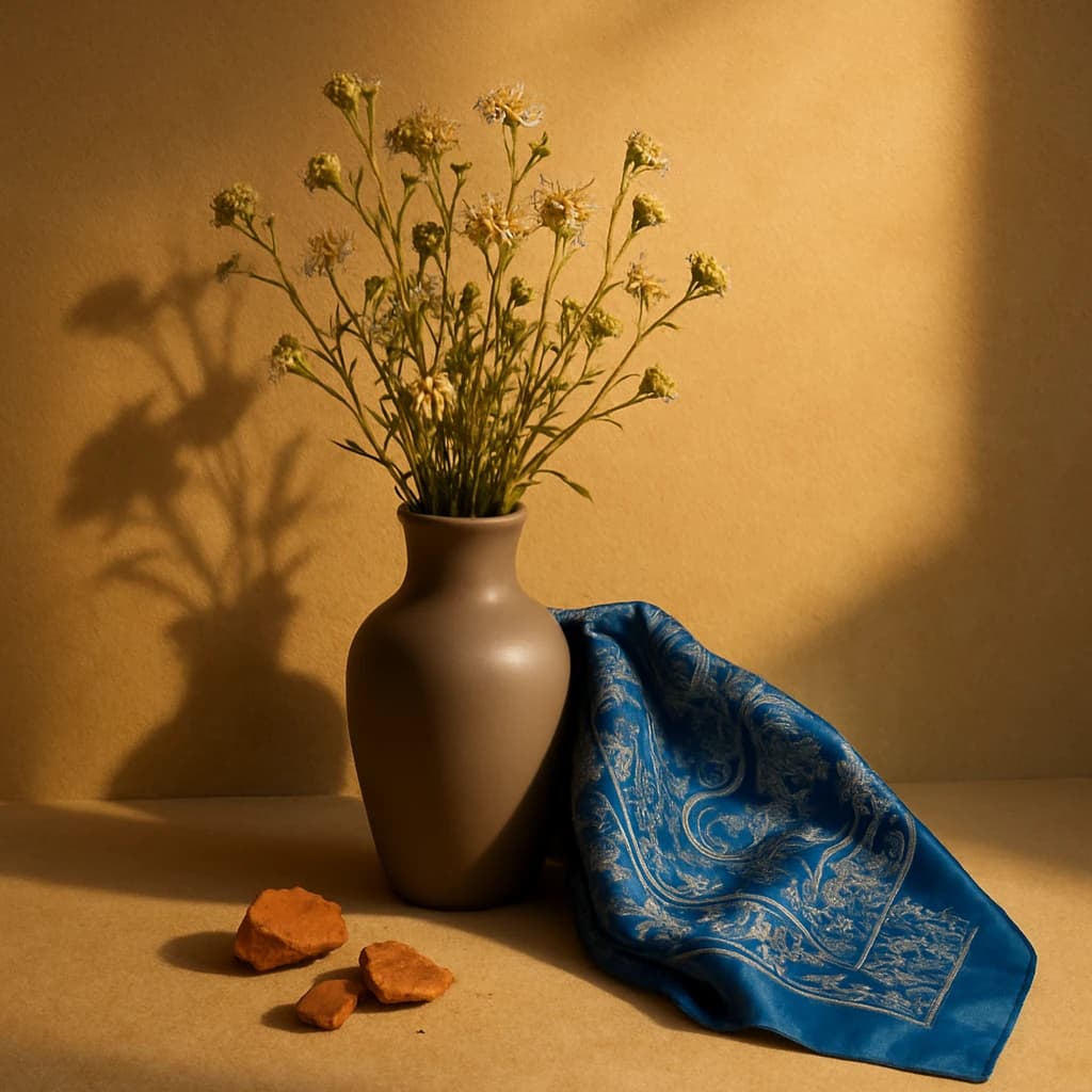
Explore the warm, inviting palette of Burnished Copper and Azure Royale, a dance of earth and sky.
The August 2026 palette captures a dance between warmth and cool sophistication. Golden Wheat (#d7a25b) dominates the scene with a grounding presence, evoking comfort and stability. This hue serves as a reassuring base for any design, reminiscent of sunlit fields.
Contrasting this is Azure Royale (#4a6a92), a regal blue that introduces depth. Its calming nature balances the warmth, perfect for adding sophistication and tranquility in branding or interiors.
Clay Vessel (#b6a28a) offers an earthy touch, grounding the palette with its organic feel. This shade is ideal for designs aiming to connect with nature and authenticity.
Bringing a burst of energy, Burnished Copper (#c9553d) invigorates the composition. Its vibrant quality is perfect for accents that need to stand out and draw attention.
Finally, Soft Petal (#f9ebd2) introduces a delicate freshness to the ensemble. This light hue is perfect for adding a touch of softness and airiness, making it suitable for backgrounds or elements needing subtlety.
- Use Golden Wheat for backgrounds in digital interfaces to provide warmth.
- Incorporate Azure Royale for text or buttons to enhance focus.
- Apply Clay Vessel in product packaging to emphasize eco-friendliness.
- Highlight details with Burnished Copper for energetic emphasis.
- Employ Soft Petal in minimalist designs for a gentle contrast.


