
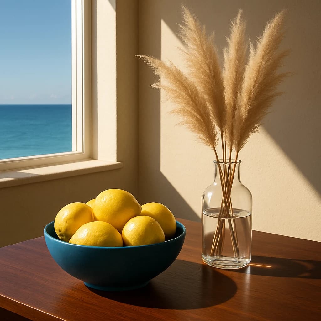
Explore the serene blend of ocean hues and sunlit warmth. Perfect for tranquil designs.
In the heart of July 2026, color trends are shifting towards palettes that merge the serenity of nature with the vibrancy of life. This palette, "Sunlit Tranquility," captures this essence perfectly, offering a harmonious blend of warmth and calm.
Wheat Whisper (#d4c097) sets the foundational tone, invoking warmth and subtlety. It's perfect for creating cozy, inviting spaces that feel both natural and refined.
Lemon Zest (#ffeb3b) brings a burst of energy. Its vividness adds freshness and vitality, making it a striking accent that enlivens any design.
Ocean Glimpse (#3a719b) cools the palette with its calming presence. This hue is ideal for infusing designs with a sense of serenity and peace, reminiscent of tranquil sea views.
Walnut Grain (#8b5a2b) grounds the palette, offering an earthy depth that balances the lighter shades. Perfect for adding a touch of stability and richness.
Pure Light (#ffffff) is the final touch, bringing clarity and openness. It enhances the overall brightness, ensuring that the palette feels spacious and welcoming.
- Use Wheat Whisper for backgrounds to maintain warmth.
- Highlight elements with Lemon Zest for a lively touch.
- Incorporate Ocean Glimpse in spaces needing calm.
- Add Walnut Grain for depth and grounding.
- Balance with Pure Light to enhance brightness.
The "Sunlit Tranquility" palette offers a versatile mix of hues, perfect for designers seeking a balance of energy and calm. Whether for interior spaces or digital designs, these colors provide a timeless and rejuvenating aesthetic.


